The worst Neo Geo cover art?

wyo

King of Spammers
10 Year Member
Joined
May 22, 2013
Posts
10,171
Aside from the eye shadow, The Super Spy cover is aiight. Better than the game anyway. Here is the Taliban Edition:

super spy.jpg
 

El Maricon Loco

Galford's Poppy Trainer,
Joined
Apr 23, 2003
Posts
3,513
Same here, don't think Super Spy competes with some of the others, but I will admit that font hurts. I don't know - anything with a military theme is target for a stencil font, but if I were trying to give off a bad-assed spy vibe, I'd be looking for a slicker font. Either subtle or slick, like 007. I think that gold was an attempt at that.
 

NeoGeoNinja

Athena's Wardrobe Manager
Joined
Dec 4, 2011
Posts
2,287
Same here, don't think Super Spy competes with some of the others...
No, it fucking DOES. Actual serious levels of competition are at hand here. Deadly fucking serious.

...but I will admit that font hurts. I don't know - anything with a military theme is target for a stencil font, but if I were trying to give off a bad-assed spy vibe, I'd be looking for a slicker font. Either subtle or slick, like 007. I think that gold was an attempt at that.

-

189841_full.jpg
 

El Maricon Loco

Galford's Poppy Trainer,
Joined
Apr 23, 2003
Posts
3,513
No, it fucking DOES. Actual serious levels of competition are at hand here. Deadly fucking serious.

I LOVE IT DUDE, flying off the handle is good shit.

Seriously though - if you'd please look at Exhibit B - Compare the fonts, which really is the worst thing about The Super Spy cover. The Ninja Combat font looks like it was drawn on a napkin then put on the box. Even if we aren't taking the HORRIBLE mongoloid art into consideration, I think the winner of shittiness is clear.

2842_288310.jpg
 

Mac91

I wonder if anyone saved my dickpic?
10 Year Member
Joined
Jan 4, 2013
Posts
3,159
NeoGeoNinja, we all know Dalton was one of the best Bonds.
 

HeavyMachineGoob

My poontang misses Lenn Yang's wang
10 Year Member
Joined
Apr 3, 2011
Posts
5,848
All the Mahjong covers are terrible, they could only be loved by a Japanese person.

I thought this one was pretty terrible in particular, seeing how it doesn't have actual box art to begin with. It's just a logo on a single color background.

aso2.jpg


The US version is way more action packed:

alphamission2.jpg
 

NeoGeoNinja

Athena's Wardrobe Manager
Joined
Dec 4, 2011
Posts
2,287
ASO II cover is a bit uninspired, but I don't particularly dislike it.

I certainly prefer it over the 'action packed' US variant.

I think they should have run with the Manual/Label/NGCD art for the JPN home cart box art myself

-

image.jpg
 

mr perkins

BANNED. RUGAL2000 FAKE ACCOUNT
Joined
Apr 19, 2014
Posts
19
Right there. It is Mega Man NES bad.
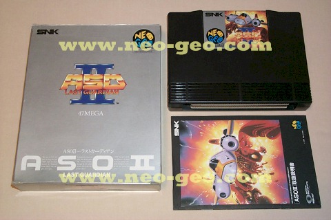
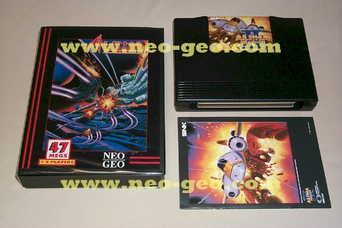
View attachment 13461

I guess it's in the eye of the beholder.fatal fury 1 Euro and dog tag are my favourite cover art of all time. Worst apart from thrash rally,is matrimilee.awful awful almost little girls toy like cover.after kid 2000 the kof 01 and 02 games on aes left a lot to be desired.
 

Electric Grave

So Many Posts
No Time
For Games.
15 Year Member
Joined
Jan 29, 2004
Posts
20,259
You folks are trashing my 3 Count Bout Full Frontal Insert...I really poured serious PS skillz on it...c'mon, it's not that bad.
 
Top