The worst Neo Geo cover art?

theMot

Reformed collector of junk
10 Year Member
Joined
Jan 22, 2012
Posts
7,612
What do you think?

I would have to give it to Thrash Rally, I mean really, you look at that cover and it's four old balding, boring looking men. The acrylic paint style doesn't do it any favors either. How would that attract a teenager to play it back in the day? It looks like the kind of artwork you would expect on a 70's product, not something from the 90's.

BoxThrashRally.jpg

How uninspiring.

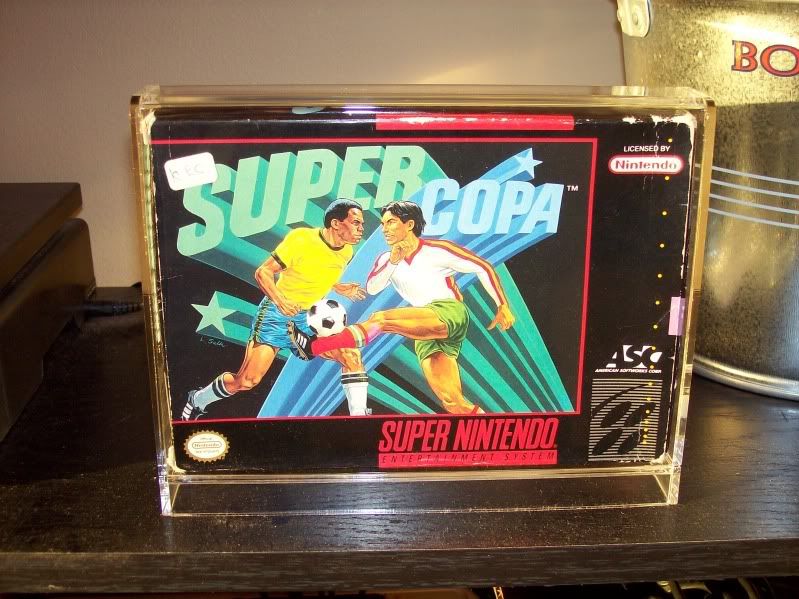
Old mate on the right looks like he's ripping a fart.
 
Last edited:

theMot

Reformed collector of junk
10 Year Member
Joined
Jan 22, 2012
Posts
7,612
The whole premise is a bit odd I will give you that. Token roid boy standing on a park bench punches Terry who then falls from a great height onto a circus tent.
 

HeavyMachineGoob

My poontang misses Lenn Yang's wang
10 Year Member
Joined
Apr 3, 2011
Posts
5,843
Depicted in the cover art is Terry and Andy. It's actually very accurate to the game, you can do 1P Vs 2P matches during the game. Though I don't think that exact setting is anywhere in the game (closest is Raiden's stage).

It may be bad, but I love it a lot. You can even see the artist's signature in the corner.
 

wyo

King of Spammers
10 Year Member
Joined
May 22, 2013
Posts
10,149
Possibly the worst and definitely the most homoerotic...

3 Count Bout American Box Art.jpg
 

massimiliano

ネオジオ,
20 Year Member
Joined
Feb 27, 2004
Posts
3,225
Right there. It is Mega Man NES bad.
View attachment 13461

swayze.roadhouse89.jpg


giphy.gif
 

El Maricon Loco

Galford's Poppy Trainer,
Joined
Apr 23, 2003
Posts
3,513
Totally Roadhouse Swayze.

I have to disagree that the FF cover is Mega Man bad. Mega Man is like fucked perspective, proportions, weirdness. Something you'd see on DeviantArt by MysticYOLO, but without ladydicks. FF isn't THAT BAD technically - just 80's airbrushed movie poster style.

Mega_Man_%u00252528NES%u00252529_US_Cover.jpg

Ninja Combat is my pick - seriously. LOL

BoxNinjaCombat.jpg
 
Last edited:

joe8

margarine sandwich
15 Year Member
Joined
Oct 25, 2007
Posts
3,740
Fatal Fury 1 US.
I prefer the Fatal Fury 1 US cover to the Japanese AES cover.
I think they thought it would appeal to the Americans more than the Japanese FF1 cover, that's probably why it's different. The fighters are changed to make them look more American than the renditions on the Japanese AES cover.
 

The Chief

U.N. Apologist,
20 Year Member
Joined
Feb 4, 2002
Posts
2,962
Super Sidekicks sucks, it's not even art. Plus that guy on the right looks like he's dropping a deuce in his shorts.

ss.jpeg
 

ViolentStorm

Windjammers Wonder
Joined
Jan 16, 2013
Posts
1,383
I would have to agree with the US version of Fatal Fury, this one is not Neo related but is completely awful.
Strider%20(6).jpg
 

Opethian

Basara's Blade Keeper
10 Year Member
Joined
Dec 22, 2009
Posts
3,668
Totally Roadhouse Swayze.

I have to disagree that the FF cover is Mega Man bad. Mega Man is like fucked perspective, proportions, weirdness. Something you'd see on DeviantArt by MysticYOLO, but without ladydicks. FF isn't THAT BAD technically - just 80's airbrushed movie poster style.


Ninja Combat is my pick - seriously. LOL

View attachment 13476

Mongoloids
 

landsharkzero

New Challenger
Joined
Feb 4, 2014
Posts
52
I would have to agree that Super Sidekicks is pretty bad. I have to put this one up, not Neo related, but possibly the worst cover art ever in a game.untitled.png
 

SNKorSWM

So Many Posts
No Time
For Games.
10 Year Member
Joined
Feb 5, 2010
Posts
15,152
If we're including stuff other than neo, it'd be this one.

100_1776.jpg


This one belongs to forum member beaglepuss.
 
Last edited:

Mac91

I wonder if anyone saved my dickpic?
10 Year Member
Joined
Jan 4, 2013
Posts
3,159
Not Neo, but hell. Russell Grant, that man has a face that makes games just fly off the shelves.

410KneUEwDL.jpg
 
Top