El Maricon Loco
Galford's Poppy Trainer,
- Joined
- Apr 23, 2003
- Posts
- 3,513
What's your picks for ugly / shitty consoles - I'm trying to keep in mind the era when it was released, because it's rather unfair to judge the console's aesthetics by current trends.
Of course, this shit is going to be subjective, and don't take my opinion as anything more than verbal diarrhea. As much as I like design, I'm not an industrial designer.
Wii - It really has no style - Usually I give more credit for simplicity - clean, minimal design usually stands up to the test of time, but the design was more lazy than minimal. From any angle except the "Hero" box-shot angle - it just looks like a bastardized external hard drive enclosure. I think the LED glow bar saved the Wii's ass from more ridicule, because in 2006 a glowing LED strip was still pretty rad. Worth mentioning is the flimsy plastic door, junky feeling 50ga.wired sensor bar, and shitty plastic stand. I'd bitch about the WiiU but Nintendo really stepped it up this time and....rounded the sides.
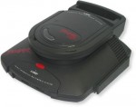
NeoCD - Top Loader - Love this console to death, and I do like the way it looks - it just looks unfinished. It also has the hollow plastic effect, lots of air space thanks to the big ass CD mech and stand. To me, it looks like the NeoCD ABS design was finished in the back, but they had to hit a deadline and stopped working on the front. I think a couple well-placed lines would have made this thing look soo much better. The back end of the system has the cool wave sides, and the vents, then you come around to the front there's just the smooth dip in the center. I think if they would have added some lines (like they did with the AES), it would have saved it from looking unfinished. Also reference the SuperFami - the lines really make that fucker pop, take those lines away and it definitely makes it look a bit cheaper.
Absolute top of my list is the Gen2 Sega CD because they feel like pieces of shit - light, flimsy, a hollow experience. Hearing that hollow CD door pop only reinforces this. You could debate it doesn't look bad for the era, sure it looks OK, but once you pick it up, it ruins it.
Of course, this shit is going to be subjective, and don't take my opinion as anything more than verbal diarrhea. As much as I like design, I'm not an industrial designer.
Wii - It really has no style - Usually I give more credit for simplicity - clean, minimal design usually stands up to the test of time, but the design was more lazy than minimal. From any angle except the "Hero" box-shot angle - it just looks like a bastardized external hard drive enclosure. I think the LED glow bar saved the Wii's ass from more ridicule, because in 2006 a glowing LED strip was still pretty rad. Worth mentioning is the flimsy plastic door, junky feeling 50ga.wired sensor bar, and shitty plastic stand. I'd bitch about the WiiU but Nintendo really stepped it up this time and....rounded the sides.
NeoCD - Top Loader - Love this console to death, and I do like the way it looks - it just looks unfinished. It also has the hollow plastic effect, lots of air space thanks to the big ass CD mech and stand. To me, it looks like the NeoCD ABS design was finished in the back, but they had to hit a deadline and stopped working on the front. I think a couple well-placed lines would have made this thing look soo much better. The back end of the system has the cool wave sides, and the vents, then you come around to the front there's just the smooth dip in the center. I think if they would have added some lines (like they did with the AES), it would have saved it from looking unfinished. Also reference the SuperFami - the lines really make that fucker pop, take those lines away and it definitely makes it look a bit cheaper.
Absolute top of my list is the Gen2 Sega CD because they feel like pieces of shit - light, flimsy, a hollow experience. Hearing that hollow CD door pop only reinforces this. You could debate it doesn't look bad for the era, sure it looks OK, but once you pick it up, it ruins it.
Last edited: