You are using an out of date browser. It may not display this or other websites correctly.
You should upgrade or use an alternative browser.
You should upgrade or use an alternative browser.
Official SNK Neo-Geo Book: NEOGEO: A VISUAL HISTORY ネオジオ〜目で楽しむ軌跡〜 (Publisher Bitmap Books)
- Thread starter frazer99
- Start date
- Joined
- Aug 22, 2000
- Posts
- 344
Yeah, I have to say that the cover misses the mark. You had the right idea with the black and gold but the art just sucks the life of it. Nice big "Neo-Geo" logo in gold foil on the black would have been infinitely better, clean and simple.
Your description is very close to what is the current design to the slip case.
- Joined
- Aug 22, 2000
- Posts
- 344
I'd tend to agree. The gold foil logo on black/dark gray would work best, and instantly be recognizable/synonymous with the AES.
Not feeling the book cover at all.
If you wanted to use the "visual" aspect for the cover, I think it would have been better to have done a collage or gotten one of the artists at SNK to draw up some original art.
I have to think it is just a placeholder and not the final cover art.
So a simple cover with use of black/gold with the Neo-Geo logo is currently in design for the slip case. I agree that this simple design is befitting of the NeoGeo and will appeal to fans of the system./games. An original piece of art from one of the SNK artists was considered but they were unable to commit to providing anything beyond their existing assets.
I think the challenge is that the ‘standard’ book will be sold as just the book itself and Bitmap Books needs the book to have broader appeal than just the hardcore fans so need an image that is recognisable to those who are perhaps on the periphery – they don’t own a NeoGeo but may be interested to read about it and buy the book.
Jontox
Quiz Detective

- Joined
- Jul 19, 2016
- Posts
- 89
I think the challenge is that the ‘standard’ book will be sold as just the book itself and Bitmap Books needs the book to have broader appeal than just the hardcore fans so need an image that is recognisable to those who are perhaps on the periphery – they don’t own a NeoGeo but may be interested to read about it and buy the book.
This is true and KOF is the most widespread brand/image linked to Neogeo for these non hardcore fans.
Zellez
King's Dry Cleaner

- Joined
- Dec 6, 2010
- Posts
- 377
I understand the need to appeal a broad audience, however I'm not sure that kof94 cover is gonna do the job.
Personally I'm rather unimpressed by it, and would have preferred something along the line of the Super Famicom box collection or the several visual compendium covers.
Personally I'm rather unimpressed by it, and would have preferred something along the line of the Super Famicom box collection or the several visual compendium covers.
Niko
Whip's Subordinate

- Joined
- May 15, 2014
- Posts
- 1,773
I think you guys got the main cover and slip cover backwards. The main cover should match the rest of the book with grey and gold neo logo. The slip cover should contain the attract art.
The KOF94 artwork also totally misses the mark for "attractiveness".
The KOF94 artwork also totally misses the mark for "attractiveness".
oliverclaude
General Morden's Aide

- Joined
- Feb 3, 2013
- Posts
- 7,688
Most recognizable? That's debatable, for a maximum of badassery there's only one, though: Real Bout.
daithidownunder
Krauser's Shoe Shiner

- Joined
- Jan 28, 2015
- Posts
- 235
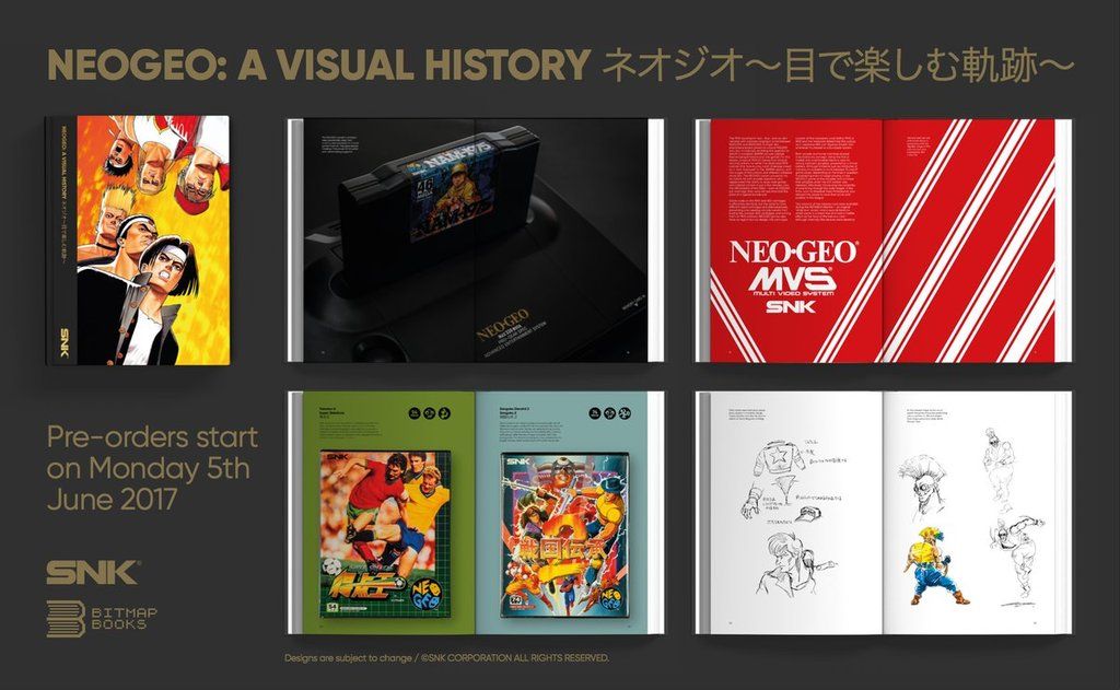
Short update from Bitmap Books on the NeoGeo Book with an image of the book cover: http://mailchi.mp/bitmapbooks/bitmap-books-may-newsletter
Thanks to everyone who has waited patiently for some news about NEOGEO: A VISUAL HISTORY since we announced it back in February.
We're delighted to say that the book is very nearly complete and currently in the final stages of proofing and checking. Watch this space as we're currently planning a proper update where we can share lots more information and designed pages.
Pre-orders will open on Monday 5th June and it's on schedule to be released in the late summer.

Sorry to be negative but...I have to agree, I really don't like the look of this at all. Neo Geo was always a "premium" console and this really does not say premium to anyone - it looks like a magazine cover and not a premium book. This would be a fine picture for the inside of the book, but definitely not for a cover.
Last edited:
mathieu4d
Crazed MVS Addict

- Joined
- Apr 27, 2015
- Posts
- 140
I tend to disagree to most comment here ")
Imho, since its a visual history its cover should be a visual which has a strong link to the neogeo story.
Not something that "represent", but a visual that is actually a piece of the neo geo story.
I believe kof94 is ok, and I kinda like the cover as it is actually.
The main goal of a cover is to tell "how it is gonna talk about the subject". And not "what is the subject".
my 50 cents
Last edited:
Niko
Whip's Subordinate
- Joined
- May 15, 2014
- Posts
- 1,773
I would prefer something more toned down, as an example:

This is awesome, much better.
- Joined
- Feb 27, 2004
- Posts
- 3,225
This is awesome, much better.
IMO Shinkiro deserves more than any other illustrator, if it comes to a cover about Neo-Geo...
- Joined
- May 8, 2002
- Posts
- 791
I would prefer something more toned down, as an example:
A little bit of class, exactly. The other one looks so low rent.
Zellez
King's Dry Cleaner
- Joined
- Dec 6, 2010
- Posts
- 377
it looks like a magazine cover and not a premium book.
Couldn't have said it better. That's exactly how I feel about it.

heihachi
Krauser's Henchman

- Joined
- Jul 11, 2016
- Posts
- 948
I don't think the current cover is as bad as some are making it out to be, but I do agree that it's not as representative of the broad selection of titles that were on the system as it could be. I mean, if this were a KOF book I think it'd be fine. But for a Neo Geo book I think a collage like the NES/SNES compendium or the blue and yellow Neo Geo logo would have been better.
KRONOS
Hardened Shock Trooper

- Joined
- Feb 18, 2004
- Posts
- 425
They could put a picture of a box of macaroni and cheese on the cover and as long as the content doesn't fail the bottle cut, ice smash, and super death blow I will buy it.
However, I wish they'd use an illustration or graphic that's more encompassing of SNK Neogeo rather than an image for one particular game that's been overused (though that KOF '94 art is one of my favorites). Can they not commission current or prior SNK artists to do something or do something like this:


However, I wish they'd use an illustration or graphic that's more encompassing of SNK Neogeo rather than an image for one particular game that's been overused (though that KOF '94 art is one of my favorites). Can they not commission current or prior SNK artists to do something or do something like this:
daithidownunder
Krauser's Shoe Shiner
- Joined
- Jan 28, 2015
- Posts
- 235
The MD book is particularly nice, something along those lines would be far more suitable.
Couldn't agree more!
PigInTheMud
Tarma's Gun Polisher

- Joined
- Jun 8, 2012
- Posts
- 109
This cover is not something I'd leave on my coffee table for my guests to see