MVS & AES NEOSD flash card... AES Version ANNOUNCED & AVAILABLE!!

benjiedude

Quiz Detective
Joined
Nov 21, 2016
Posts
86
What would be helpfull neosd if you took the artworks, and printed off a copy to size (does not have to be full quality) and then tape it onto your shell and post a photo of that. This helps demostrate how it will look in reality.

Totally agree on this.
 

neosd

Neosd Developer
Joined
Oct 18, 2016
Posts
956
Hello

We will try to do it about next week for sure, once Alien feels that the design is mature enough.

We still dont have a date for the shells, factory is doint changes on the mold right now, its really bad times for factory work cause christmas.

We keep doing overwork to make the product better and better everyday.

Thanks


What would be helpfull neosd if you took the artworks, and printed off a copy to size (does not have to be full quality) and then tape it onto your shell and post a photo of that. This helps demostrate how it will look in reality.
 
Last edited:

Razoola

Divine Hand of the UniBIOS,
Staff member
20 Year Member
Joined
Nov 12, 2002
Posts
4,662
You have the proto shell from the video you can use. A quick print or the artwork via a standard inkjet printer, then sellotape it to that shell would do the job to see how the current design would look. I have done this with artwork many times in the past, its the only way to see how it will look before you commit the final design to the printers. Then you have to think about paper choice etc
 

benjiedude

Quiz Detective
Joined
Nov 21, 2016
Posts
86
You have the proto shell from the video you can use. A quick print or the artwork via a standard inkjet printer, then sellotape it to that shell would do the job to see how the current design would look. I have done this with artwork many times in the past, its the only way to see how it will look before you commit the final design to the printers. Then you have to think about paper choice etc

Yes, yes and yes please. Great ideas Razoola
 

aku

Loyal Neo-Disciple
Joined
Dec 31, 2015
Posts
834
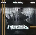
quickly added some "goldish" lines...looks pretty finished...at least for me^^

qck.JPG
 

JMKurtz

Tech Support Moderator,
20 Year Member
Joined
Aug 12, 2000
Posts
1,654
That would be really cool if they can have those printed with gold foil on those stripes.
 

Black_Tiger

Kuroko's Training Dummy
Joined
Feb 7, 2005
Posts
72
I've been working on my own label design in case I decide to replace the official one, but that mockup with gold lines is now nice enough that I'd probably stick with it.
 

alienpdx

n00b
Joined
Dec 3, 2016
Posts
12
i cant see any of the attachment , most likely due to my level of noobness on this forum.
got another link ?
 

Rot

Calvin & Hobbes, ,
Joined
Jul 8, 2003
Posts
11,441
i cant see any of the attachment , most likely due to my level of noobness on this forum.
got another link ?

I will resolve that now...

xROTx

PS. Done...

EDIT... Even Jeff is amazed by my awesomeness:D
 

alienpdx

n00b
Joined
Dec 3, 2016
Posts
12
thx for fixing, rot

the gold lines, its funny ,coz i just added mvs-red lines this afternoon in a spare minute ;)

https://snag.gy/b7FyBn.jpg , dont really like the floating lines on the right in the gold-lines design , they look random (but thats just me ;) )
 

pipes

DO NOT DEAL WITH!!!, DEAL OUTSTANDING!
Joined
Jan 28, 2010
Posts
2,711
That's sexy as hell. I'd ditch the lines to the right of the logo though.
 

fenikso

Slug Flyer Pilot
15 Year Member
Joined
Oct 6, 2004
Posts
3,937
The lines (both the red and the gold version) add a ton to picture. Nice nod to the home games.
 

benjiedude

Quiz Detective
Joined
Nov 21, 2016
Posts
86
Now we're getting somewhere! Gold lines are sweet! I agree...a foil print would be excellent.

Update: just saw the red lines too on Alien's update. Like it better.
 
Last edited:

Jontox

Quiz Detective
Joined
Jul 19, 2016
Posts
89
These two stripes add definitely something to the sticker...
Between red and gold, I would prefer the gold but more pronounced and shiny. I think these really need to be on top of everything, no shadow or transparency effect.
For the color, as least for me, GOLD cries for AES and RED for MVS (see my point 5 below)

Does this color association remind you something (see below) ?

Hereunder more in-depth advise after my first rushed feedback:

1- My point is that your neosd logo has a tiny of this blue color (see picture below) in there and feel not completely integrated on the metal background, too contrasted without any transition or color gradient. What about a color gradient with that same blue that would permit a smoother transition and put the neosd logo more in evidence.
2- The MVS logo on the upper right hand feels really too small at least for the text underneath it Multi Video System, it doesn't seem it will be nice once printed.
3- I'm not spanish at all, but what about a MADE IN SPAIN on the below right hand corner ?
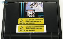
4- The two horizontal stripes are inspired from this type of offical design (see second picture), it doesn't seem too awkward for me.
5- The difference from MVS or AES could potentially only be the AES or MVS logo swapping or changing as well the color of the stripes...

Just my 2 cents, these remarks are not a critic but constructive :), ... more on next picture update ...

DSC00508.jpg
1572-3.jpg


thx for fixing, rot

the gold lines, its funny ,coz i just added mvs-red lines this afternoon in a spare minute ;)

https://snag.gy/b7FyBn.jpg , dont really like the floating lines on the right in the gold-lines design , they look random (but thats just me ;) )
 
Last edited:

poodude

B. Jenet's Firstmate
Joined
Jul 16, 2008
Posts
405
Blue lines in the same color as the neoSD logo would look pretty sick. You could even do "©2016 Made In Spain" under the horizontal lines.
 
Last edited:

Xian Xi

JammaNationX,
15 Year Member
Joined
Dec 1, 2005
Posts
27,750
The electric arcing around the NeoSD logo needs to pop more. Kinda like my Avatar but not as extreme.
 

Razoola

Divine Hand of the UniBIOS,
Staff member
20 Year Member
Joined
Nov 12, 2002
Posts
4,662
Im also of the opinion the gold adds something. I'm not sure of the 2 hortz lines though. Maybe the NeoSD logo needs to be moved right slightly (so its centered in the tank shadow) and those hortz lines either shortened or removed.
 
Last edited:
Top