You are using an out of date browser. It may not display this or other websites correctly.
You should upgrade or use an alternative browser.
You should upgrade or use an alternative browser.
Omega MVS Cartridge Shells: Kickstarter Now Live!
- Thread starter shadowkn55
- Start date


- Joined
- Dec 9, 2006
- Posts
- 2,386
Just two other tries...I promise those are the last ones, I won't bother you all any more
View attachment 13659 View attachment 13660
Classy.
ChiefofSB
Geese's Thug

- Joined
- Feb 27, 2013
- Posts
- 275
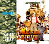
Thanks! Oh sure, I wonder why I didn't thought this myselfI've already done some more labels with the help of the shockbox inserts. For example with MSX I tried to mimic the AES camo style
View attachment 13655
Man i was loving the Metal Slug label with the red but this is just awesome nice work bro.
venchia3
n00b

- Joined
- Oct 19, 2003
- Posts
- 43
Classy.
Man i was loving the Metal Slug label with the red but this is just awesome nice work bro.
Thank you so much
made KOF97 yesterday...by the way if you have some suggestions to improve those labels (especially on the font used for the spine titles) let me know! I really hope they can be useful. Quan, tell me if it's not the right place to post the labels, I hope not to disturb this thread 
- Joined
- Dec 9, 2006
- Posts
- 2,386
Thank you so much
View attachment 13676
I think if you use a smaller version of the game's logo instead of plain text on the spine, it'll look good. Otherwise, a black border around the text would do well to provide some contrast against the background.
venchia3, feel free to post your creative works in this thread. You're doing great work.
venchia3
n00b
- Joined
- Oct 19, 2003
- Posts
- 43
I think if you use a smaller version of the game's logo instead of plain text on the spine, it'll look good. Otherwise, a black border around the text would do well to provide some contrast against the background.
venchia3, feel free to post your creative works in this thread. You're doing great work.
Thank you for the suggestions! Did a quick try with the black border around text, looks better I think, here you are some results


Attachments
Last edited:
Sure, no problem
View attachment 13651
That looks great and holy smokes the other ones do too! Nice detail on the use of Multi Video System in between NEO GEO,great work!
- Joined
- Nov 12, 2002
- Posts
- 4,662
These are not something I would ever use but I would like to add an opinion, please ignore it if you do not agree. I feel that if your going to design labels for a new cart system it would be good to have some rules on colors etc before going further. For example the left side color (red in metal slug) may be well to be the same color through all metal slug games. The same color through all kof games and so on. Maybe this is just my personal preference on how I like things ordered but I though I would through it out there.
I really like the camo on MSX but but feel something should be done to make the SNK and Neo Geo writings stand out more.
They are looking great I agree but will they look the same once they bend around the cart case? By this I mean is it good to have the picture bending around the case to the spine? Maybe it is but then again maybe it isn't. It can make some titles harder to read as already pointed out. I personally prefer the way your kof98 looks compared to kof97 due to the way I imagine it to look once on the cart. Flat in the form you have here in the thread then I prefer kof97.
I hope I'm making sense and please don't take my comments in a negative way. I think your doing a great job.
Raz
- Joined
- Dec 12, 2003
- Posts
- 7,157
These are not something I would ever use but I would like to add an opinion, please ignore it if you do not agree. I feel that if your going to design labels for a new cart system it would be good to have some rules on colors etc before going further. For example the left side color (red in metal slug) may be well to be the same color through all metal slug games. The same color through all kof games and so on. Maybe this is just my personal preference on how I like things ordered but I though I would through it out there.
I really like the camo on MSX but but feel something should be done to make the SNK and Neo Geo writings stand out more.
They are looking great I agree but will they look the same once they bend around the cart case? By this I mean is it good to have the picture bending around the case to the spine? Maybe it is but then again maybe it isn't. It can make some titles harder to read as already pointed out. I personally prefer the way your kof98 looks compared to kof97 due to the way I imagine it to look once on the cart. Flat in the form you have here in the thread then I prefer kof97.
I hope I'm making sense and please don't take my comments in a negative way. I think your doing a great job.
Raz
Similar to shocks, if I were to use these. I would probably make the labels myself and definitely have some sort of faux "brand guidelines" for them to keep them as authentic as possible. But similar to shock covers, it's the wild west. You just have to sift through the chaos to find the good stuff. But yes, totally agree.
venchia3
n00b
- Joined
- Oct 19, 2003
- Posts
- 43
I feel that if your going to design labels for a new cart system it would be good to have some rules on colors etc before going further. For example the left side color (red in metal slug) may be well to be the same color through all metal slug games. The same color through all kof games and so on. Maybe this is just my personal preference on how I like things ordered but I though I would through it out there.
I agree on this too, since they are just a try I thought I could show different color scheme and maybe, with some suggestions as this one, improve or find a sort of guideline to follow
It would be really easy to change image position/font/colors.
I really like the camo on MSX but but feel something should be done to make the SNK and Neo Geo writings stand out more.
They are looking great I agree but will they look the same once they bend around the cart case? By this I mean is it good to have the picture bending around the case to the spine? Maybe it is but then again maybe it isn't. It can make some titles harder to read as already pointed out. I personally prefer the way your kof98 looks compared to kof97 due to the way I imagine it to look once on the cart. Flat in the form you have here in the thread then I prefer kof97.
I thought on this aswell, that's why I asked Quan the exact measures of the labels, so that I could create the guides in photoshop and try to avoid as much as possible to place dramatic parts of the art in wrong places. The only one that would look not so great is actually King of Fighters 97, since I couldn't find the proper artwork as of the other titles I tried. I will show you my template (nothing great) of MSX, with improved visibility on the SNK logo and the probable part of the image that will see a bending

Now that I think about it, maybe I can place the SNK logo and image a little bit lower
Thank you all so much for the suggestions, and obviously I know there are members with a lot more skills than me, so those labels are by no means pretending to be some sort of "official omega" thing...far from it, I just wanted to contribute with something, waiting that one day the shells will actually be produced
Last edited:
- Joined
- Nov 12, 2002
- Posts
- 4,662
I agree on this too, since they are just a try I thought I could show different color scheme and maybe, with some suggestions as this one, improve or find a sort of guideline to follow
It would be really easy to change image position/font/colors.
I thought on this aswell, that's why I asked Quan the exact measures of the labels, so that I could create the guides in photoshop and try to avoid as much as possible to place dramatic parts of the art in wrong places. The only one that would look not so great is actually King of Fighters 97, since I couldn't find the proper artwork as of the other titles I tried. I will show you my template (nothing great) of MSX, with improved visibility on the SNK logo and the probable part of the image that will see a bending
View attachment 13706
Now that I think about it, maybe I can place the SNK logo and image a little bit lower
Thank you all so much for the suggestions, and obviously I know there are members with a lot more skills than me, so those labels are by no means pretending to be some sort of "official omega" thing...far from it, I just wanted to contribute with something, waiting that one day the shells will actually be produced
It looks like you have though things through well, I agree maybe it would be good to move the blue SNK logo a little lower in your MSX example going on your template lines. The white border makes it stand out more also. Maybe it will work in white (instead of SNK blue) with black border also.
venchia3
n00b
- Joined
- Oct 19, 2003
- Posts
- 43
It looks like you have though things through well, I agree maybe it would be good to move the blue SNK logo a little lower in your MSX example going on your template lines. The white border makes it stand out more also. Maybe it will work in white (instead of SNK blue) with black border also.
Thank you
actually I do think that the only way to fully understand how the arc portion of the labels looks like is to try on a actual shell, until that very moment it's a bit difficult to perfectly predict how it will bend eheh but I have to say, the template is kinda easy to adjust, so it won't be a problem eventually in the future to adjust according to the look and feel on a real omega shell. Right now I'm keeping more than an eye to adjust all the artworks so that dramatic portions won't bend over the arc...unfortunately it's not possible on all the artworks...but I have to say even SNK on their AES had this problem (KOF97 - usa or jp - have the artwork placed in a really odd way, cutting off Iori's head eheheh)Just like the old labels I think the genre colors should be standardized as well.
I agree, no problem in doing that, opened to all sort of color/font/logo suggestions
- Joined
- Apr 3, 2011
- Posts
- 5,857
Genre colors only applied to English AES labels. There was zero consistency with Japanese AES.
I do like that the physical placement of the label affects how much end label there is, means these new labels can't really be used on AES.
The labels look fine, sort of a neat merging of English and Japanese styles. Though I feel there should be something in the upper left corner, maybe ©199# SNK.
I do like that the physical placement of the label affects how much end label there is, means these new labels can't really be used on AES.
The labels look fine, sort of a neat merging of English and Japanese styles. Though I feel there should be something in the upper left corner, maybe ©199# SNK.
venchia3
n00b
- Joined
- Oct 19, 2003
- Posts
- 43
Ok, tried to apply to MSX some of your suggestion:
1- lowered the SNK logo and made it white with a dark green border
2- placed the ©1999 SNK in the upper left portion of the label
3- changed the color and border size of the spine title
4- tried to add a really thin border to the NEO-GEO logo, in order to make it pop out of the camo

1- lowered the SNK logo and made it white with a dark green border
2- placed the ©1999 SNK in the upper left portion of the label
3- changed the color and border size of the spine title
4- tried to add a really thin border to the NEO-GEO logo, in order to make it pop out of the camo
xsq
Thou Shalt Not, Question Rot.,
- Joined
- Jan 17, 2013
- Posts
- 7,414
not to crap on the good stuff going on here, but working on these labellayouts doesn't bring the shells any closer to production... never hurts to be ready, sure. But what's the point? If you got too much time on your hands mow some lawns and donate the money to Quan
BerryTogart
Bolt Thrower.,
- Joined
- Mar 21, 2014
- Posts
- 1,408
The Kickstarter is over and the goal has not been reached, I'd like to pick a couple of those up for my few games - were there any plans to revive this?
venchia3
n00b
- Joined
- Oct 19, 2003
- Posts
- 43
not to crap on the good stuff going on here, but working on these labellayouts doesn't bring the shells any closer to production... never hurts to be ready, sure. But what's the point? If you got too much time on your hands mow some lawns and donate the money to Quan
Eheh you hit a good point here
")
- Joined
- Nov 12, 2002
- Posts
- 4,662
Ok, tried to apply to MSX some of your suggestion:
1- lowered the SNK logo and made it white with a dark green border
2- placed the ©1999 SNK in the upper left portion of the label
3- changed the color and border size of the spine title
4- tried to add a really thin border to the NEO-GEO logo, in order to make it pop out of the camo
View attachment 13735
I have to say in my opinion you have got the lower SNK and Neo Geo logo excellent over the camo. Much better than the blue in the previous version. I'm not sure I like the new added copyright though but then again it may look good once its on the cart. Maybe it just needs moving down a little so its aligning with the game title in the spine.
Last edited:
Those are good looking labels, but my suggestion would be to try and keep the main artwork on the front and keep the arch-area clean, and then a logo on the spine/top. This way the artwork is not distorted, and you can easily see what game it is, if you store your games loose in a box or drawer or something. Or maybe just on top of eachother on a shelf. Either way, i think it would look nicer that way.
venchia3
n00b
- Joined
- Oct 19, 2003
- Posts
- 43
I have to say in my opinion you have got the lower SNK and Neo Geo logo excellent over the camo. Much better than the blue in the previous version. I'm not sure I like the new added copyright though but then again it may look good once its on the cart. Maybe it just needs moving down a little so its aligning with the game title in the spine.
Thank you so much! Will try to improve for certain
Those are good looking labels, but my suggestion would be to try and keep the main artwork on the front and keep the arch-area clean, and then a logo on the spine/top. This way the artwork is not distorted, and you can easily see what game it is, if you store your games loose in a box or drawer or something. Or maybe just on top of eachother on a shelf. Either way, i think it would look nicer that way.
I know and I would do that without problem...it all depends on the artwork "condition"...unfortunately for MSX I could not resize it properly since the highest resolution image I've found for the game was from a shockbox insert, and unfortunately I had to resize like that in order to hide the insert custom graphics that were placed on top of the original artwork
KalessinDB
Mr. Big's Thug

- Joined
- Dec 17, 2013
- Posts
- 202
I love all the label art in here if nothing else. The Cover Project has ignited my love of "aftermarket" video game art, if you will. Especially semi-standardized stuff like you seem to be doing here.
I'm way late on the Kickstarter sadly, but this is definitely something I look forward ot if my MVS collection ever gets to a respectable level.
I'm way late on the Kickstarter sadly, but this is definitely something I look forward ot if my MVS collection ever gets to a respectable level.
IMO I do prefer the blue logo, without the copyright. Anyway, I love that project and hope we will have soon brand new shells and stickers for our MVS carts. The best would be to get those like shock box and inserts.I have to say in my opinion you have got the lower SNK and Neo Geo logo excellent over the camo. Much better than the blue in the previous version. I'm not sure I like the new added copyright though but then again it may look good once its on the cart. Maybe it just needs moving down a little so its aligning with the game title in the spine.