Nice Work Borman!
I think the white background for the Atomiswave inserts are the Best!
They are really clean, and will look Great in a bookcase.
The Gray ones by Loopy look dull, and don't work with the logos.
(Logos look pasted on). I'm not trying to dis Loopy because he does some great work.
comments on your layout:
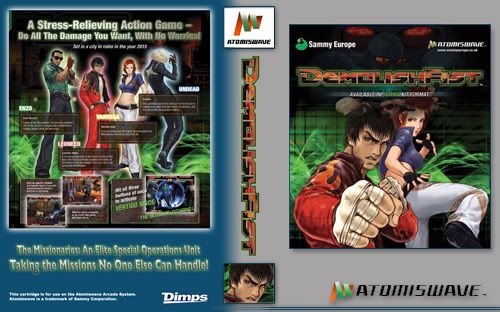
The picture on the front Rocks!
The Neowave Titles on the front and spine are too big
Logos on the bottom and spine are too small
...I think the Sammy logo is now replaced by SEGA.
The Red line was intended to extend from the spine to the back of the insert.
Overall, I think the back of the Insert needs work.
Mostly with the content: Information and ratings.
I have some Great Ideas for the back layout,
and will update the attached picture soon...
(see attached)
8MAN


")


