I have a 5X Pro that I was going to use as a CRT replacement, but as it turns out my TV is too old and crappy so when the screen scrolls with dark backgrounds/graphics everything dims until it stops scrolling (refresh rate is too slow I guess). The 4K is probably good enough to replace CRTs for most people, but I don't even own a 4K TV. Maybe I should sell my 20M4U and by a nice one and a RT4K?
")
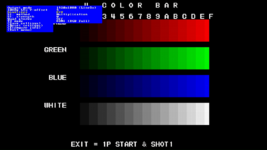
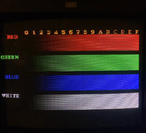
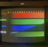
I tried to use the color bars to do this, but either I'm already pretty balanced or I can't see the nuanced gradients on the SNES version like I can in your picture. I *think* I got it to a good place by reducing the green a ton. I tried to take some pictures using my iPhone but we all know how that turns out (any hints for that?). Anyway with the two I did take you can't really see the color balance very well, but you can see how it appears that on the left side that the green is brighter than red and blue for 0 and 1. No matter how much I lowered the green the balance always seems to be this way on the color bard.