PhotoShop gurus: here's an idea

aria

Former Moderator
Joined
Dec 4, 1977
Posts
39,546
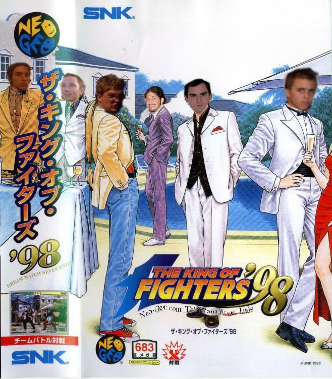
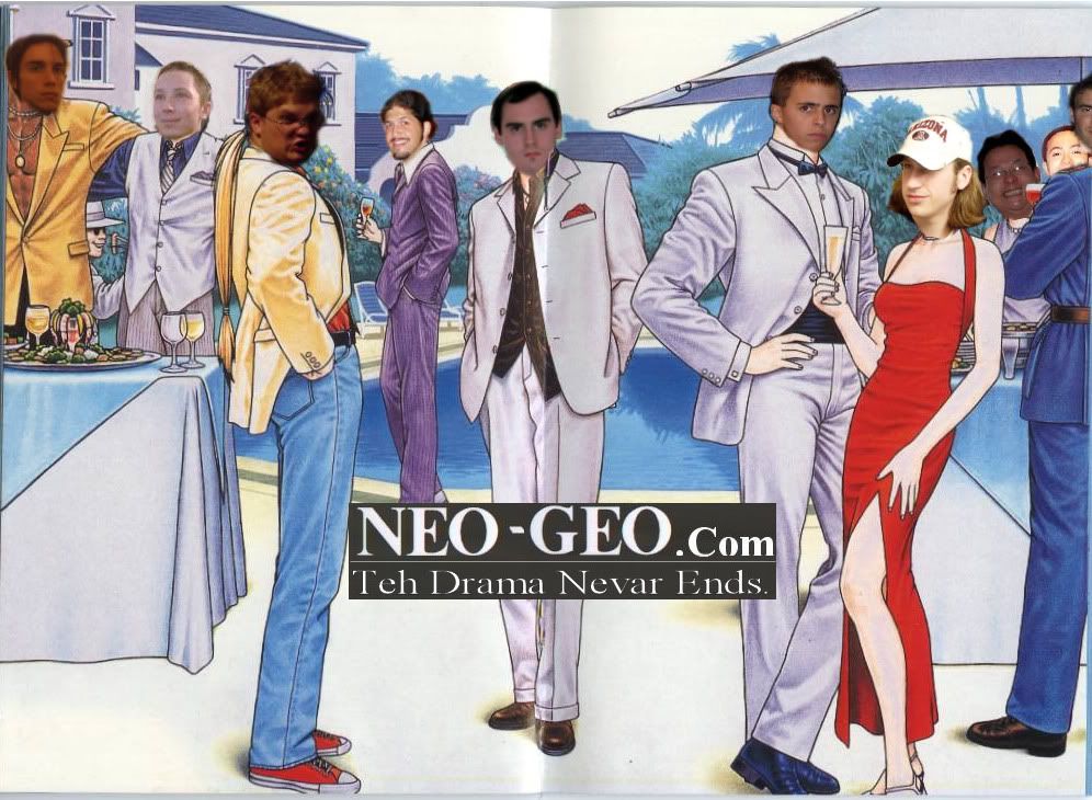
Someone should photoshop the KOF '98 [JPN] insert to say "Neo-Geo.com: Teh Drama Never Ends" and maybe photoshop some of the drama king's avatars onto the character heads:

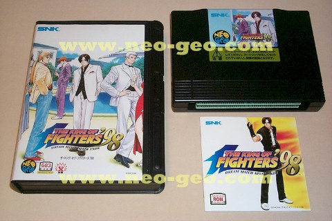
For reference, although you'd want to find a better version than this
http://www.neo-geo.com/snk/carts/jap/kof98.jpg
 

FrostbayneAucti

Tung's Hair Stylist
Joined
Aug 30, 2004
Posts
1,035
When I saw this thread in creative, and thought about the nights "Event" I freaked a little, LOL I thought you had betrayed the oath of the gardeners!!! :)

These would be great to get to put in shock boxes to hide stuff in your collection
 

Curt

apostate
Joined
Feb 2, 2004
Posts
7,710
This is a work in progress. NOT DONE.
kof98Notext-Wip-001.jpg


I spent a shit load of time, learning how to curve text, around mathematical lines drawn point to point. As you can see the curved text needs alot of work.

Or I can get rid of the King Of Fighters logo and then just put Neo-geo.com. But i'd have to either create the missing parts of the legs, or find some other non-logo art.
 

k'_127

NeoGumby's Sycophant,
20 Year Member
Joined
Jun 12, 2002
Posts
6,724
Curt said:
This is a work in progress. NOT DONE.
kof98Notext-Wip-001.jpg


I spent a shit load of time, learning how to curve text, around mathematical lines drawn point to point. As you can see the curved text needs alot of work.

Or I can get rid of the King Of Fighters logo and then just put Neo-geo.com. But i'd have to either create the missing parts of the legs, or find some other non-logo art.

hahahaha that's just perfect :lol:
 

Robert

,
20 Year Member
Joined
Dec 18, 2000
Posts
5,748
Even photoshopped, Bobak still looks cool. that's first class style!!!
 

Lime2K

Host for Orochi
Joined
Jul 30, 2004
Posts
762
try making the words bold, and anti-aliasing them -- they should turn out better.
 

aria

Former Moderator
Joined
Dec 4, 1977
Posts
39,546
That is amazing!

I admit I thought the KOF would be the NG.com, but that looks sharp.

I also admit I'm surprised by how good I look photoshopped into that picture :loco:

Good call on Mushiki. I think you did an excellent job of just grabbing photos that matched the bodies. Looking at that photo you'd wonder why Mak would have trouble with women :p
 

Neo Gold

(no need to shout), Because Rot is Watching YOU!
Joined
May 21, 2004
Posts
1,281
Heh...thats great!...i understand bobak is in the centre....but who are the rest from left to right???
 
H

hermegildo

Guest
From what I can tell, Makismo is Kyo and Mushiki is Heavy D. Can't say I recognize the other three.
 

Curt

apostate
Joined
Feb 2, 2004
Posts
7,710
That no Logo one could be very helpful.. ill work with that a bit, and make a NG.com logo. and Sweeten it up.

THe people are from left to right

Mushiki, Wizkid007, Neo-Geo2, Bobak, Makismo, and Mr. Kevums. (I'm going to make that one less blurry)
 

abasuto

Orgy Hosting Mod
15 Year Member
Joined
May 26, 2004
Posts
22,221
LOL. :lol: :lol:
Great job Curt.
Bobak in the purple pimp suit = Flawless.
 

Curt

apostate
Joined
Feb 2, 2004
Posts
7,710
Here's Version 2.

NEOGEODRAMA-wtext-2.jpg


For me, it's just about impossible to re-create the KOF text/style. So I just made a rather plain thing.

New Faces... Shawn, EvilWasabi, Spike, and Rotphungte.

It was really difficult to find a side profile pic that would fit Heidern, evil wasabi looks like hes got an exorcist neck thing going on.

And I know Spike isn't much of a Drama King, but his long blong hair seemed to work well.

Heres a version without the text if someone wants to make better text, and/or add in the stuff to make it look like an insert. I feel i'm done with this project... I should have been studying.

http://img.photobucket.com/albums/v97/CurtWRX/Long Thread - Randomness/01/NEOGEODRAMA-w-o-text-2.jpg
 

abasuto

Orgy Hosting Mod
15 Year Member
Joined
May 26, 2004
Posts
22,221
Spike looks good in red.

Makismo amazingly would look very serious sporting a suit.
 

aria

Former Moderator
Joined
Dec 4, 1977
Posts
39,546
Wow, V2 looks great!

I would only suggest getting Mr. Kevum's head proportional to v1. It's a little too small now.

Oh man... Spike is hillarious :p
 

LWK

Earl of Sexyheim
20 Year Member
Joined
Jan 5, 2001
Posts
18,070
Deadly funny, I love you guys!
 

Curt

apostate
Joined
Feb 2, 2004
Posts
7,710
Bobak said:
Wow, V2 looks great!

I would only suggest getting Mr. Kevum's head proportional to v1. It's a little too small now.

Oh man... Spike is hillarious :p

Yah I Know, When Iwas sizing em up it became really apparent how strange Shinkiro's sense of proportion is. The others I had to oversize the heads a bit. Mr. Kevums is the only one that actually fits the original head size.

Most art books say a man should be 7 "heads" tall. His are like 9.
 

Curt

apostate
Joined
Feb 2, 2004
Posts
7,710
Here's Version 3.

Kevums Head is larger. Perhaps comically large. But I like it.

Especially with Spike at his side... Pretty funny to me.

NEOGEODRAMA-wtext-3.jpg


Edit, I totally didn't even notice Choi back there behind mushiki... Someone should be there....
 
Last edited:

neo>all

Super nO0b
Joined
Jan 21, 2005
Posts
4,339
If mak actually wore a suite like that he'd actually have a shot at getting an ugly chick
 

Curt

apostate
Joined
Feb 2, 2004
Posts
7,710
Version 4.

Lithy's Head is tiny. But I guess that's the price to pay, if you're choi, and you love tiny little sausages.

N3o4.jpg
 

Robert

,
20 Year Member
Joined
Dec 18, 2000
Posts
5,748
Two comments:
I never realized that Spike was so hot
I realize how good is the KOF 98 cover. Damn, everything is right with this game!!!
 

galfordo

Analinguist of the Year
15 Year Member
Joined
Mar 14, 2003
Posts
18,418
Robert said:
Two comments:
I never realized that Spike was so hot
I realize how good is the KOF 98 cover. Damn, everything is right with this game!!!

All he needs is a rotten tooth and a lot more of t3h drama, and he would look just like this chick I used to have a crush on. :kekeke:
 
Top