You are using an out of date browser. It may not display this or other websites correctly.
You should upgrade or use an alternative browser.
You should upgrade or use an alternative browser.
Last Blade FF Work
- Thread starter NeoCverA
- Start date
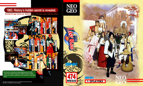

Is the back 1/2 of the insert white on the homecart? I haven't looked at it (or played it) in ages. Personally, I think the light brown/taupe color from the front would fit better in the white space on the back.
Just my visual impression.
Just my visual impression.
- Joined
- Aug 30, 2001
- Posts
- 349
Beautiful
- Joined
- Mar 14, 2003
- Posts
- 18,418
Terrific as usual NeoC.
What about trying a variation that doesn't have the circular symbol with the crescent and leaves on it? Might look cool to have a front with just the characters on it.
Anyway, just a thought. I can't wait until these finally get released. I'll be back at Kinko's, breaking copyright laws and sawing away with the edge trimmer ...
- Joined
- Nov 16, 2001
- Posts
- 4,042
lb2 :
that round stamp like thing on the spine would look way better in a brownish color. similar to the bg color of the front artwork.
i'd also extend it a bit towards the back, but let the character images and screenshots look as if they were on a layer above it.
hard to describe ...
other than that, i agree about the leaves.
- Joined
- Jun 25, 2004
- Posts
- 683
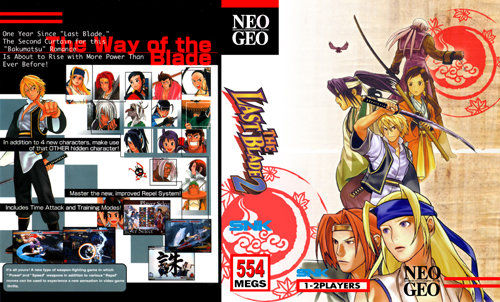
I like the Front on LB2 alot.  The LB1 front is "almost there", I would zoom in to the cover image more with less of the tan gradient. Both backs could be integrated more with the spine. As they are, the transitions are a bit harsh.
Cheers,
Ben
Edit: for example, getting rid of the black line between the back and spin on LB2 then letting the "red stamp" carry over into the back (but behind the character artwork), might do the trick
The LB1 front is "almost there", I would zoom in to the cover image more with less of the tan gradient. Both backs could be integrated more with the spine. As they are, the transitions are a bit harsh.Cheers,
Ben
Edit: for example, getting rid of the black line between the back and spin on LB2 then letting the "red stamp" carry over into the back (but behind the character artwork), might do the trick
Last edited:
Clear Paper said:Beautiful
seconded