- Joined
- Jun 25, 2004
- Posts
- 683
Looks good. Due to the different types of games I would think the purple code would be more fitting than the yellow.
Good idea, the yellow really sticks out, and not in a good way...
Edit: Fixed!
Last edited:
Looks good. Due to the different types of games I would think the purple code would be more fitting than the yellow.

true.le geek,
I really dig your inserts and if I ever get into shocks I would def use a ton of your stuff.
Keep up the good work!
When will these be up on the Southtown website i wanted to add them to my cart but didn't see them

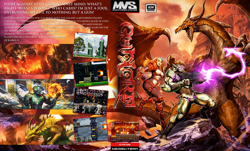
near finished Gunlord insert...
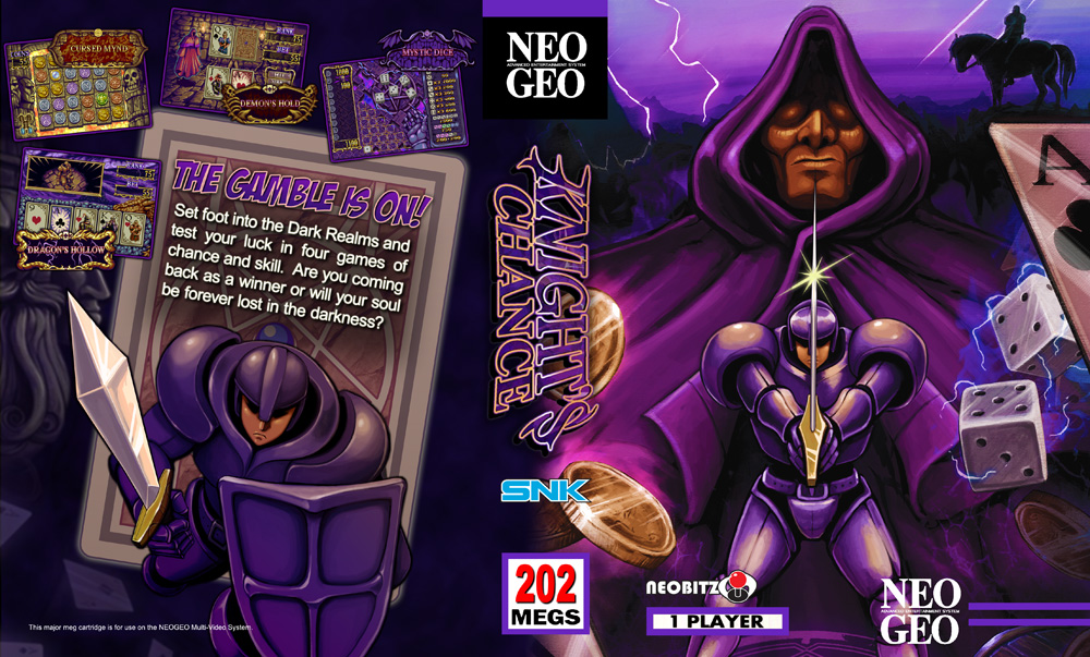
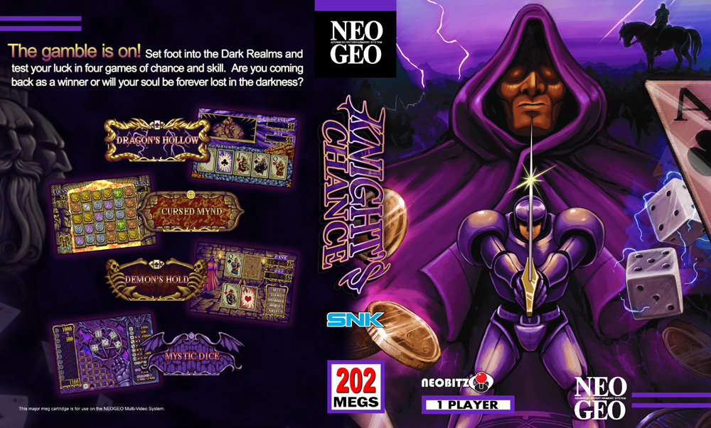
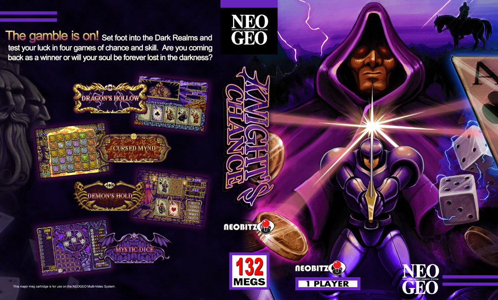
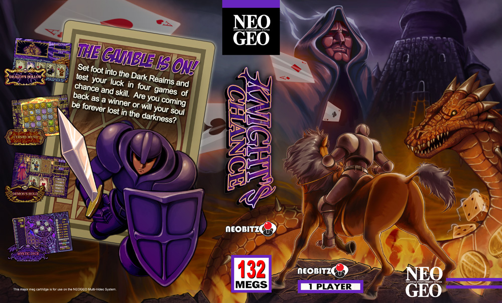
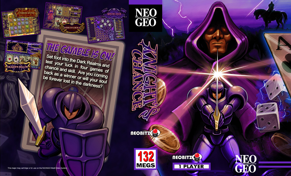
Tim Jonsson, the pixel and cover artist working on Knight's Chance graciously offered some high quality art assets. Here is my revised Shock insert, as well as an alternate look.
I may make a third variant of the first one, with the back layout of the 2nd one...
EDIT: Third Variant below...
Thanks so much Tim!
Cheers,
Ben

Are they final? If so, when will they be available on your site? I'm assuming the game will ship soon, so I would very much like to print one before it's shipped. They look great by the way....so much so that's it's very hard to pick one
Soon. I'm waiting to see if I should make any changes when the game is released.
Cheers,
Ben

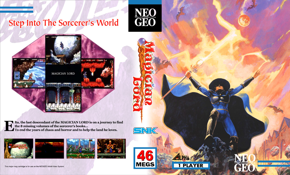
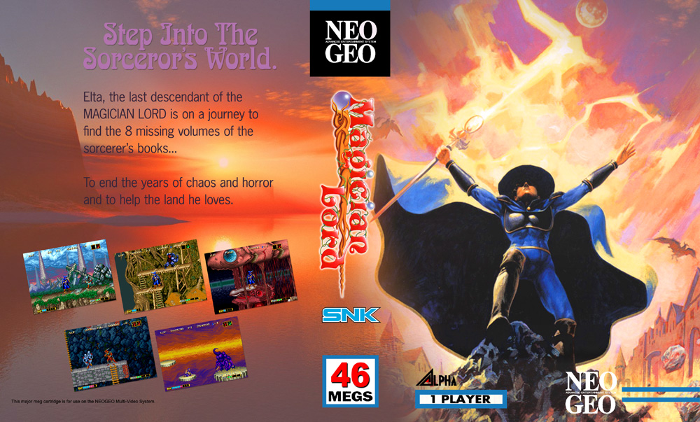
You might want to remove the SNK and replace with the Neobitz logo.
")
Nah, I like the SNK logo, plus it offers a nice color contrast. I'm calling these done...
Cheers,
Ben
It does make it pop, it wasn't because I didn't like the look of it. I think it should be fine since it's fan made.
I could do one that way. Which one would you pick?
I'm calling these done...
Cheers,
Ben

Dat Dragon... awesome work!