You are using an out of date browser. It may not display this or other websites correctly.
You should upgrade or use an alternative browser.
You should upgrade or use an alternative browser.
New NG.com Logo?
- Thread starter Dandy-J
- Start date
- Status
- Not open for further replies.


- Joined
- Apr 8, 2007
- Posts
- 1,657
I think it looks pretty cool. I mean, not that it will be adopted here or anything, but nice.
Dandy-J
Crazed MVS Addict

- Joined
- Jan 7, 2008
- Posts
- 145
jdd1510 said:I think it looks pretty cool. I mean, not that it will be adopted here or anything, but nice.
Thanks jdd! If it doesn't get adopted I'm okay with it, I just had a creative spurt last night.
")
Dr. Jigglin
Seasoned Expert
20 Year Member
10 Year Member
15 Year Member
1 Year Member
25 Year Member
- Joined
- Feb 13, 2005
- Posts
- 25,449
These are nice I must say. Great job.
I like the logo as it is, even though it's old and boring and relatively average. It's been the same since before I joined and till now.
I like the logo as it is, even though it's old and boring and relatively average. It's been the same since before I joined and till now.

- Joined
- Oct 3, 2005
- Posts
- 6,253

Dandy-J
Crazed MVS Addict
- Joined
- Jan 7, 2008
- Posts
- 145
Rade said:Whatever language that is under the logo is something I can't read and don't care for.
Too big
Too many colours.
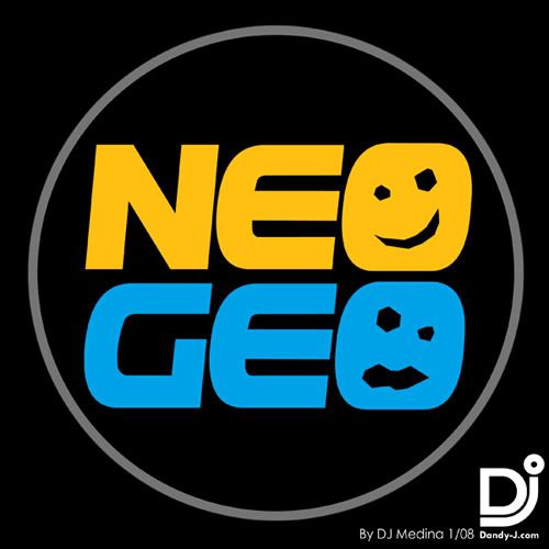
I suppose it is a bit busy isn't it? Okay, I made this one using the graphic that I made for my avatar. Less busy and no moon speak. Oh, the large size is merely to show the image better. It can be scaled down easily but that's assuming that someone actually wants to use this for the site.
Looking at this again, I like the simple look myself.

Dandy-J
Crazed MVS Addict
- Joined
- Jan 7, 2008
- Posts
- 145
galfordo said:I say take away the asian symbols on the first one and you've got a winner.
Thanks for the useful input galfordo, I did that and posted it here:
http://www.neo-geo.com/forums/showthread.php?p=2439726#post2439726
Thanks!
- Status
- Not open for further replies.