You are using an out of date browser. It may not display this or other websites correctly.
You should upgrade or use an alternative browser.
You should upgrade or use an alternative browser.
Some guitarist drawing...PartDeux <--A.K.A.: I have a scanner please rate my artworks
- Thread starter seba_boi
- Start date
black_wizardd
Nom-nom-nom 1975, ,
- Joined
- Feb 16, 2001
- Posts
- 513
Top notch drawings dude, really like the Strider one (although they all rock IMO).
Just one question, did you draw those from your mind or did you use something for reference? I'm not saying I've seen them before or that they are copied, or anything like that, just curious that's all.
Just one question, did you draw those from your mind or did you use something for reference? I'm not saying I've seen them before or that they are copied, or anything like that, just curious that's all.
seba_boi
Terry Bogard's Taylor

- Joined
- May 18, 2003
- Posts
- 1,675
No reference for the poses, all freehand; you can tell, some of them aren't perfectly drawn... It's hard to draw poses without basing it on something visual... But I used my Capcom Design Works and Street Fighter Eternal Challenge for costume reference...black_wizardd said:Top notch drawings dude, really like the Strider one (although they all rock IMO).
Just one question, did you draw those from your mind or did you use something for reference? I'm not saying I've seen them before or that they are copied, or anything like that, just curious that's all.
Last edited:
black_wizardd
Nom-nom-nom 1975, ,
- Joined
- Feb 16, 2001
- Posts
- 513
seba_boi said:No reference for the poses, all freehand; you can tell, some of them aren't perfectly drawn... It's hard to draw poses without basing it on something visual... But I used my Capcom Design Works and Street Fighter Eternal Challenge for costume reference...
Wow, that makes them even more impressive!
sQuareh4t3r
formerly "sQuareh4t3r", then "MacGuffin", now "sQu
- Joined
- Nov 23, 2003
- Posts
- 2,661
Not bad, but putting random Japanese (especially the characters for the company's name) in an illustration doesn't make it cool.seba_boi said:
seba_boi
Terry Bogard's Taylor
- Joined
- May 18, 2003
- Posts
- 1,675
sQuareh4t3r said:Not bad, but putting random Japanese (especially the characters for the company's name) in an illustration doesn't make it cool.
 You caught on!...
genjiglove
So Many Posts
No Time
For Games.
- Joined
- Mar 17, 2003
- Posts
- 15,080
Wow man, I'm really impressed with your talent. Those are some top notch drawings. Do you draw professionally? I can imagine comic book companies taking an interest.
sQuareh4t3r
formerly "sQuareh4t3r", then "MacGuffin", now "sQu
- Joined
- Nov 23, 2003
- Posts
- 2,661
I've been studying Japanese since high school, so seven years' worth of time makes one develop a mild proficiency in such things. Haven't been back in a few years, though, so most of my speaking abilities are going right down the tube.seba_boi said:
Anyway, not to get off topic, I like the illustrations, but I think that the shading could be a bit more dynamic. Seems like I'm looking through a vaseline-covered lens at them or something...
H
hermegildo
Guest
The drawings are pretty good, but they are nowhere near professional level.genjiglove said:Wow man, I'm really impressed with your talent. Those are some top notch drawings. Do you draw professionally? I can imagine comic book companies taking an interest.
seba: Something I noticed in this latest batch (and in that Zangief drawing from a while back) is that you need work on your anatomy. You're getting away with mostly nothing but outlines and simple shapes, and that works with your style to some extend, but some of the stuff looks really weird upon close inspection and could use some more definition IMO.
Just some constructive criticism.
seba_boi
Terry Bogard's Taylor
- Joined
- May 18, 2003
- Posts
- 1,675
Thanx and sadly no (or not yet--I try to be positive)... I still have years before me to practice and hone my drawing skills... And at the same time, I'm practicing on my typography and editorial design skills... I have great interest in those three fields...genjiglove said:Do you draw professionally?
Hmmm... Maybe you can help me... What do you mean by being more dynamic?... These grayscale ones are really typical shadings, I'm still practicing off Photoshop... And I can only get away with so little with a mouse....sQuareh4t3r said:Anyway, not to get off topic, I like the illustrations, but I think that the shading could be a bit more dynamic. Seems like I'm looking through a vaseline-covered lens at them or something...

Unfortunately, yes... I have a tendency to wing off anatomy... It's a bad habit of mine that I just sketch like mad trying to pass off a passable pose I had in mind, but in reality, I have a hard time drawing off-hand... I have been practicing lately since I was required to draw some stuff for a school project...hermegildo said:The drawings are pretty good, but they are nowhere near professional level.
seba: Something I noticed in this latest batch (and in that Zangief drawing from a while back) is that you need work on your anatomy. You're getting away with mostly nothing but outlines and simple shapes, and that works with your style to some extend, but some of the stuff looks really weird upon close inspection and could use some more definition IMO.
Just some constructive criticism.
H
hermegildo
Guest
All anatomy is really, is just memorization. This muscle goes here, this one stretches when this moves, this goes like this in relation to this, etc, etc, etc. Practice is your best friend here, along with reading some books on the subject and going back to them constantly. I have trouble with anatomy myself, and some of my stuff looks 10x better by just having things in the right places.
H
hermegildo
Guest
Good stuff.
Your style is really growing on me, very Capcom-ish.
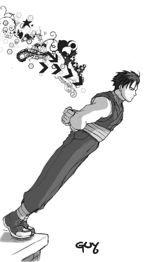
The only thing that looks really off is that Guy pose. He's got not weight whatsoever, his silhoutte is just a straight line and, while that'd work on a standing pose, he's supposed to be off-balance so it's not very convincing. Think of where his weight should be and how you'd represent that. I'd probably curve/bend his whole body upward and tilt his head up a little bit to show stability. Or you could try the opposite and see how that works, or even s-curves for that matter. It depends on what kind of feeling you want the drawing to have, but I'd play the trial and error game on something as complicated as an off-balance pose.
Do you scan your pencil lines and then color it digitally or is it all done by computer?
Your style is really growing on me, very Capcom-ish.
The only thing that looks really off is that Guy pose. He's got not weight whatsoever, his silhoutte is just a straight line and, while that'd work on a standing pose, he's supposed to be off-balance so it's not very convincing. Think of where his weight should be and how you'd represent that. I'd probably curve/bend his whole body upward and tilt his head up a little bit to show stability. Or you could try the opposite and see how that works, or even s-curves for that matter. It depends on what kind of feeling you want the drawing to have, but I'd play the trial and error game on something as complicated as an off-balance pose.
Do you scan your pencil lines and then color it digitally or is it all done by computer?
Last edited:
OmegaSaber
Beast Buster
- Joined
- May 18, 2003
- Posts
- 2,109
I really like your stuff, you've got a great feel for that classic Capcom style. And really with a little more detail and a good colorist your stuff would probably be there with the stuff they're doing with the SF and Darkstalkers comics that are out there. And I like the simplicity and cleanliness of your art, you don't always need things to be super detailed or crazy in your face to be good. Sometimes a line drawing is just that, a line drawing.
seba_boi
Terry Bogard's Taylor
- Joined
- May 18, 2003
- Posts
- 1,675
HERMEGILDO: Yep... I still pencil... But I'm now practicing digitally...
OMEGASTAR: Thanx!... I try to be as much Asian Capcom anime style instead of being the westernized anime styles...
I'm posting again 'cuz I need help with critiques... I really need some positive (meaning helpful critiques) feedbacks on what I'm doing wrong or should be doing... I'll post my last two b&w SF fanarts....
And here's my attempt to colour... I didn't start colouring just until last month... Here's where I need your feedbacks!... Fire away!!!!!
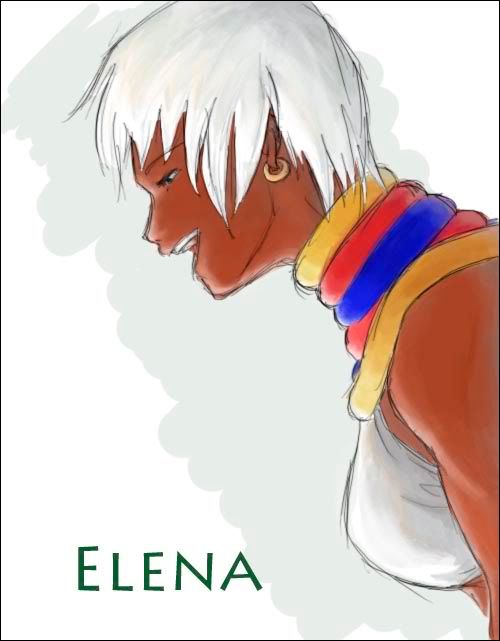
Here's just a practice run for Elena:
And I'm completely unsatisfied with this piece... Lots of texture problems:
Thanx y'alll...
OMEGASTAR: Thanx!... I try to be as much Asian Capcom anime style instead of being the westernized anime styles...
I'm posting again 'cuz I need help with critiques... I really need some positive (meaning helpful critiques) feedbacks on what I'm doing wrong or should be doing... I'll post my last two b&w SF fanarts....
And here's my attempt to colour... I didn't start colouring just until last month... Here's where I need your feedbacks!... Fire away!!!!!
Here's just a practice run for Elena:
And I'm completely unsatisfied with this piece... Lots of texture problems:
Thanx y'alll...
H
hermegildo
Guest
That's a lot of artwork in one post and I'll try my best at giving you a helpful critique, but let me get this out of the way first: I really enjoy looking at your stuff. You know your Capcom characters very well and it's pretty obvious that Bengus, Edayan, Ikeno and all that gang have influenced your work. If you don't know who these people are, do yourself a favor and get the Eternal Challenge artbook. You'll enjoy it a great deal, though I'm pretty sure you must have it already.
With that out of the way, let's start with the stuff I like.
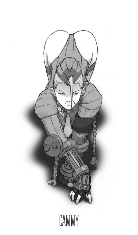
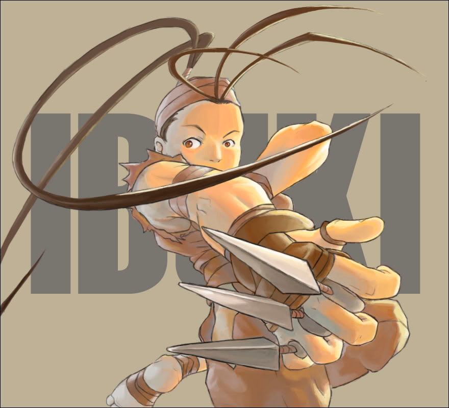
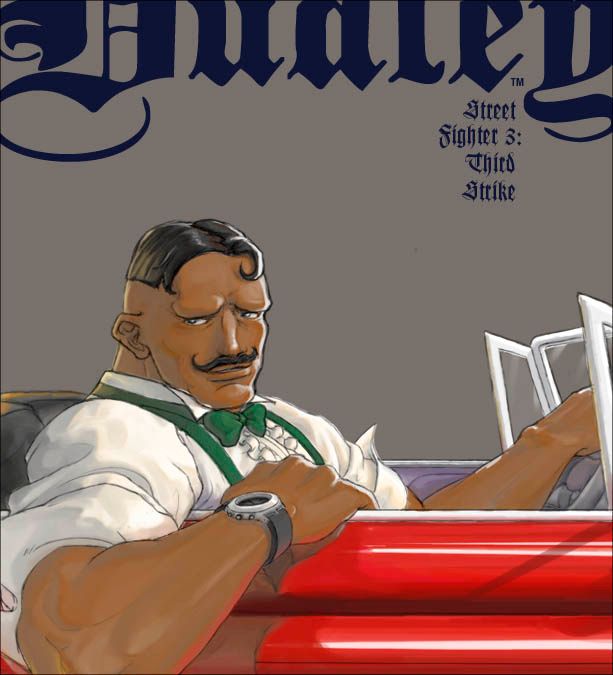
The poses Cammy and Ibuki are in are fairly complicated and you pulled them off pretty succesfully, especially Ibuki with all that foreshortening. Complicated poses are always challenging and it's good that you're not trying to avoid them. Dudley is easily one of my favorites out of everything you've posted, despite the fact that you said you don't really like it. Drawing characters in every day situations is very SNK-ish and you pulled that off really well with him. I would've probably given him sunglasses (because Dudley is cool like that), but that's just me.
Your coloring is good, really good. Not so much with Elena (but that was done rather quickly I assume) but Ibuki and Dudley look really good. You've got a good sense of where shadows and highlights go and you're using colors in really interesting ways (like how Ibuki's shadows are some kind of pale-ish blue) and that is somethig I'll think about when doing my own stuff. My only complaint in that aspect, is that these drawings could use a bit more contrast, but that might not be what you're giong for.
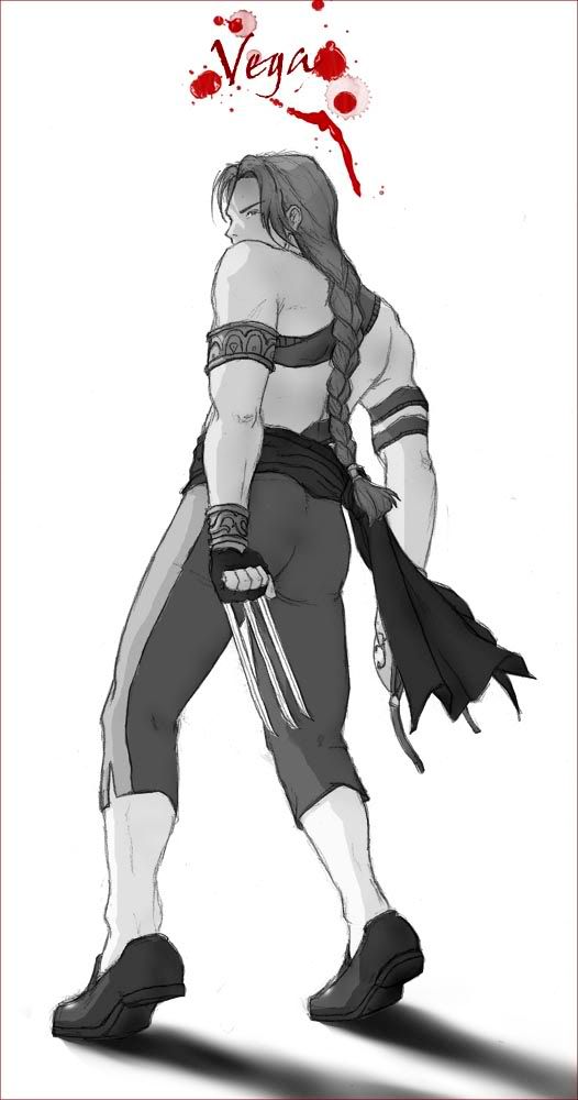
As far as actual critique goes, well, my biggest problem (and the drawing I like the least from this batch) is Vega. His pelvis is bigger than his shoulders even with slight foreshortening and it just looks off. He is also shorter than he should be and his left arm looks weird anatomically speaking. I'd say you just didn't spend enough time in pulling that drawing together and I'm sure something looks odd to you as well. Elena is kinda "meh" too but, as I said, I'm assuming it was a quick sketch rather than a more completed piece.
Cammy, even though how I mentioned how I liked the pose, looks off as well. I had a hard time pinpointed the problem, but I think it's because her butt and pelvis are higher than they should be. If look at only her head, arms and shoulders, ignoring the rest of her body, it looks like a straight on pose, which means that her pelvis should be mostly covered by her head. I don't know if I'm explaining myself well here, but if you trace where her left arm hits the ground and where her knees would be hitting the ground, you can see that the distance between those two is larger than the distance between her head and her butt and it should be almost the same. I think the best way to fix this without discarding that pose is to give her arms more foreshortening, at least her left one, which is the one that is acting as support and should be hitting the ground fairly vertically.
As for more general stuff, I'd say that you could benefit from grabbing an anatomy book and studying it like hell. That's one of the biggest issues people like you and me have and the Cammy and Vega issues I mentioned might've been avoided with a better knowledge of the human body. Also, even though I praised it to no end, I think you shouldn't start coloring yet. I always mention how wrong I think it is when people start coloring when their pencil/line work isn't up to snuff and this is no different. I'm not saying your line work is bad (it's pretty good actually) but just like me or anybody else, it could always be better and there are noticeable areas for improvement.
Those are my two cents.
I hope I didn't bore you to tears.

With that out of the way, let's start with the stuff I like.
The poses Cammy and Ibuki are in are fairly complicated and you pulled them off pretty succesfully, especially Ibuki with all that foreshortening. Complicated poses are always challenging and it's good that you're not trying to avoid them. Dudley is easily one of my favorites out of everything you've posted, despite the fact that you said you don't really like it. Drawing characters in every day situations is very SNK-ish and you pulled that off really well with him. I would've probably given him sunglasses (because Dudley is cool like that), but that's just me.
Your coloring is good, really good. Not so much with Elena (but that was done rather quickly I assume) but Ibuki and Dudley look really good. You've got a good sense of where shadows and highlights go and you're using colors in really interesting ways (like how Ibuki's shadows are some kind of pale-ish blue) and that is somethig I'll think about when doing my own stuff. My only complaint in that aspect, is that these drawings could use a bit more contrast, but that might not be what you're giong for.
As far as actual critique goes, well, my biggest problem (and the drawing I like the least from this batch) is Vega. His pelvis is bigger than his shoulders even with slight foreshortening and it just looks off. He is also shorter than he should be and his left arm looks weird anatomically speaking. I'd say you just didn't spend enough time in pulling that drawing together and I'm sure something looks odd to you as well. Elena is kinda "meh" too but, as I said, I'm assuming it was a quick sketch rather than a more completed piece.
Cammy, even though how I mentioned how I liked the pose, looks off as well. I had a hard time pinpointed the problem, but I think it's because her butt and pelvis are higher than they should be. If look at only her head, arms and shoulders, ignoring the rest of her body, it looks like a straight on pose, which means that her pelvis should be mostly covered by her head. I don't know if I'm explaining myself well here, but if you trace where her left arm hits the ground and where her knees would be hitting the ground, you can see that the distance between those two is larger than the distance between her head and her butt and it should be almost the same. I think the best way to fix this without discarding that pose is to give her arms more foreshortening, at least her left one, which is the one that is acting as support and should be hitting the ground fairly vertically.
As for more general stuff, I'd say that you could benefit from grabbing an anatomy book and studying it like hell. That's one of the biggest issues people like you and me have and the Cammy and Vega issues I mentioned might've been avoided with a better knowledge of the human body. Also, even though I praised it to no end, I think you shouldn't start coloring yet. I always mention how wrong I think it is when people start coloring when their pencil/line work isn't up to snuff and this is no different. I'm not saying your line work is bad (it's pretty good actually) but just like me or anybody else, it could always be better and there are noticeable areas for improvement.
Those are my two cents.
I hope I didn't bore you to tears.
The Drizzle
Whip's Subordinate

- Joined
- Jul 29, 2004
- Posts
- 1,759
brb gonna fap to Cammy
- Joined
- Jan 12, 2001
- Posts
- 13,393
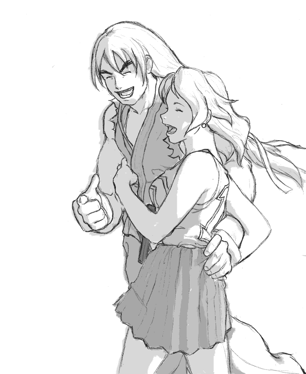
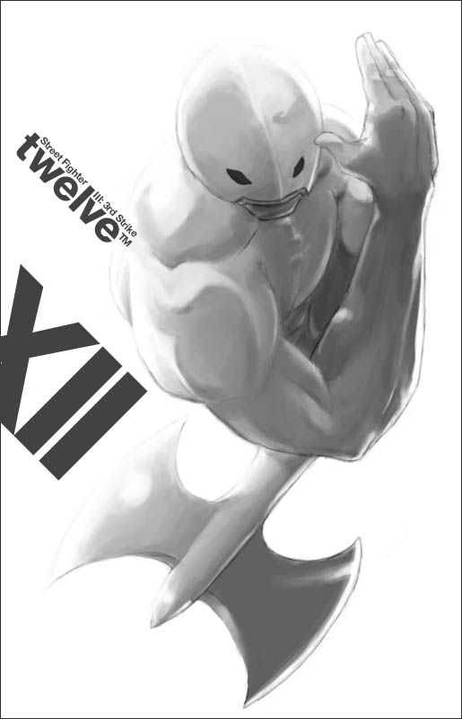
seba_boi said:Zangief:
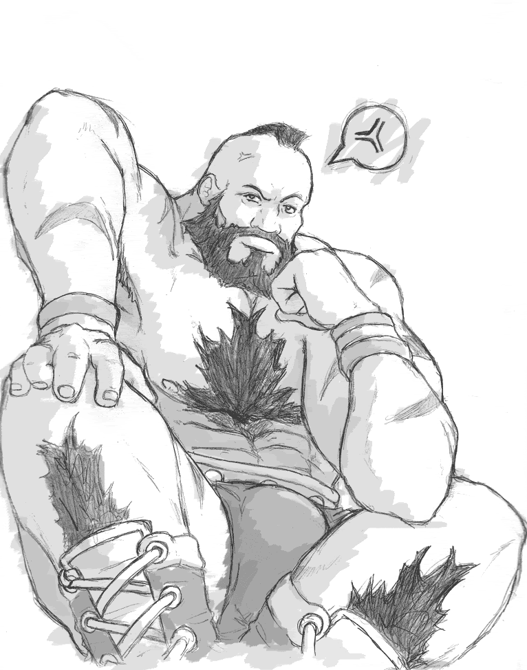
First time I've drawn Zangief... The guy's a balloon...
hahah
the lord of battle.
you have some nice sketches man.
i'm properly impressed.
hey.
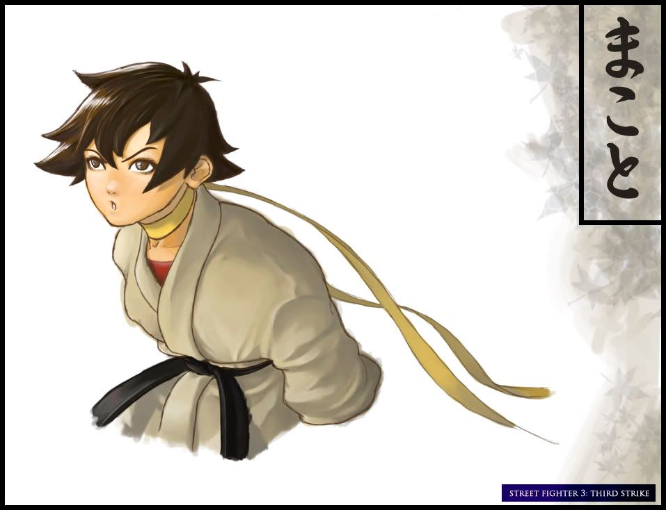
and got any of makoto?
i like the elena one plenty.
seba_boi
Terry Bogard's Taylor
- Joined
- May 18, 2003
- Posts
- 1,675
Thanks thanks thanks for the replies... Especially HERMEGILDO, appreciate the critiques... You're totally right about the Cammy, the pose is very wrong, but I kinda just winged it eh (actually I referenced a Vibe cover with Brandy)... I am currently studying some anatomies, but haven't applied yet to any final works that I'm about to post (this is old and prior to the anatomy studies)... Still working the lines and somewhat (trying) studying colour theory... Here's some new batch of works (got some Makoto RAREHERO and btw I bought Wonderfalls DVDs--EXELLENCE that was cancelled too early! I actually saw the guy that played Eric shopping in my local mall just last week):
(This one I did apply some of the anatomy lessons I've been studying):
(This one I did apply some of the anatomy lessons I've been studying):
")