Isn't that the beauty of it all really? Discovering all the inconsistencies...
Seeing US Samuai Shodown label slapped over a Japanese one and saying to yourself, WTF?
BB
Haha!
That's a great way to put it to be honest.
Like finding out that that one revision of home cart systems have metal shrouds inside & others don't, etc.
Another nice little fun fact: the NGCD is the only system where they utilized spinecards outside of Japan. A bit of an oddity to say the least as spinecards primarily served a real purpose in Japan & were more superfluous outside of there.
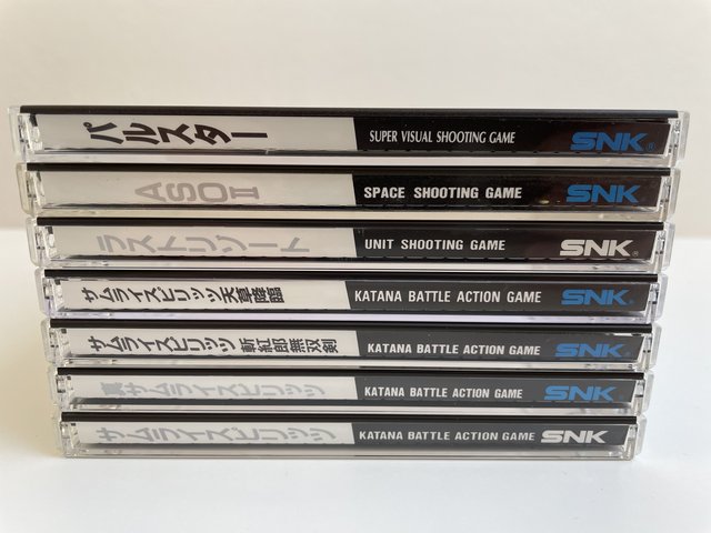
I'm curious: Some Neo Geo CD games have a blue SNK logo on the spine, while others have a white logo.
Anybody know the meaning behind this?
I'm pretty sure whether the game's title is in silver or black typeface denotes whether the game was already back-catalogue during the system's release (silver) or a new release (black), but the logo color has me stumped.

Do you mean the logo only or the font & lettering as well?
Part of the Neo Geo CD aesthetic that SNK corporate chose was a printed silver finish that had a faint shimmer to it with a semi matte finish. This was present throughout the run I believe I was used for euro "Neo Geo" system logo, "SNK logo, NGCD logo, etc on the manual front ads well as much of the spinecard (front, rear & spine itself). The intro of the CD hardware was 94 which saw the release of a wave of back catalog software from 91' first gen titles such as Nam, Magician Lord, etc up to about KOF 94 & all in between. Those CD titles had the single layer silver for the spine text & logo using a universal font. This was changed in 95 & from 95 onward they went to black text on the spine & full color "SNK" & "CD" logo's. The font for the text, while standardized was mixed up from time to time depending on the title. Add to that thet later releases such as Metal slug 2, Pulstar, Last Blade, etc saw full color game illustration artwork used on the from of the spinecards.
I did not work at SNK but it is blatantly apparent that the reason SNK did this was not so much because it looked better (though there may be those who think that there is a charm to the silver sides) but because it was much more legible & identifiable. As I mentioned above, spinecards were a retail point of sale item that came to be in Japan with CD based software (audio & game) due to the limited shelf real estate in shops over in Japan. Software/title were not "fronted" at retail like here in the US & elsewhere (where they were stacked longways, with the album fronts.....and album art facing the consumer). Instead titles were slotted on shelves packed together in long rows, vertically, with the spines facing out. Text on spines of CD software without spinecards were on the bent paper case backs that were recessed inside the clear plastic case, making them more difficult to read & identify. Spinecards increased legibility significantly by having increasing the surface area of spine & putting the text on the outside of the case . Slight but significant increases in this legibility at retail by consumers at is a significant deal in the end so those changes were made.


