You are using an out of date browser. It may not display this or other websites correctly.
You should upgrade or use an alternative browser.
You should upgrade or use an alternative browser.
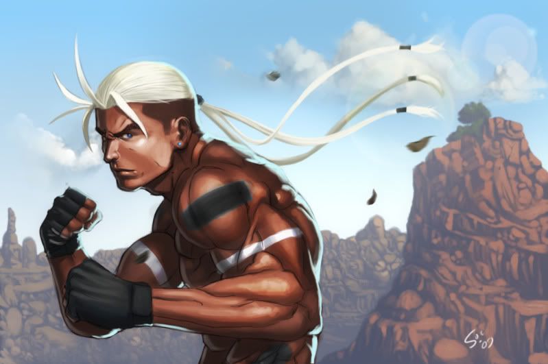
rick strowd fanart
- Thread starter Gowcaizer
- Start date

- Joined
- Jan 29, 2004
- Posts
- 20,259
The canyon looks great the colors complement Rick very well. I personally would have made the mound on the right a bit more prominent, it looks real good and is kind of sad to see it faded out like that. Perhpas then use the fill diference for the actual background, in other words the backgropund could have the intensity of the right mound and then the right mound could be a bit more intense.
Great Anatomy BTW.
Great Anatomy BTW.
bemanicho1
Ninja Combat Warrior

- Joined
- Jan 16, 2006
- Posts
- 534
Nice. Rick Strowd needs to come back in a new game/sequel.
")
- Joined
- Jan 29, 2004
- Posts
- 20,259
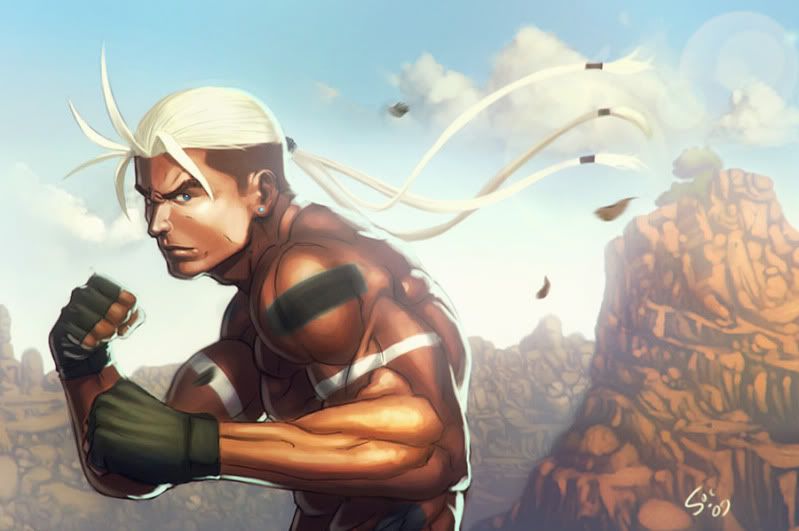
I like it, the screening makes the atmosphere way more tanglible now.