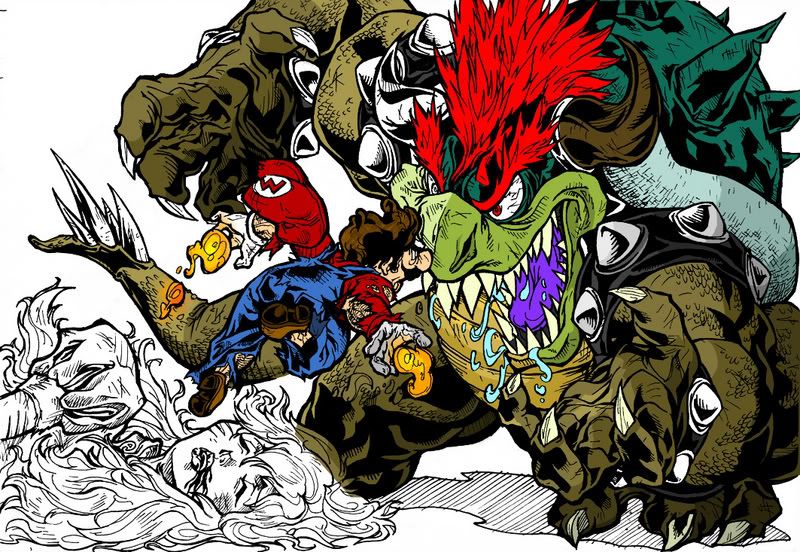
Mario vs. Bowser (finally finished coloring).

H

hermegildo

Guest
mariovsbowserbx0.jpg


Nesagwa made me ink it.

Might color it eventually.
 
Last edited:

not sonic

King of Typists,
15 Year Member
Joined
Dec 12, 2003
Posts
9,327
good job man.

if it wasnt for Diavle18, i'd say you were the best one here.
 

Jedah Doma

Chroma Ma' Doma!,
Joined
Jun 5, 2004
Posts
9,902
Nesagwa said:
He's saying youre jealous of retarded looking photoshop drawings.

Yea, he needs a tan background with Japanese characters all over it to make it look so cool.:tickled:
 

beatifik

Ace Ghost Pilot
15 Year Member
Joined
May 19, 2003
Posts
1,316
dude you gotta vary your line weight.

i seriously couldn't even see mario for like the first minute i looked at the sketch. then i saw his torso and i thought bowsers tail was coming out of mario's waist. like it was some power-up that you thought might be cool, mutant-mermaid mario.

it's a good start.
 

Ajax

way more american than wyo, way more
15 Year Member
Joined
Oct 9, 2005
Posts
5,094
Looks great. Would love to see it colored.
 

K_K

Honourary Irishman.,
20 Year Member
Joined
Oct 31, 2001
Posts
15,918
and it was done on my birthday. awesome. colored version will be my next background.
 

terry.330

Time? Astonishing!
20 Year Member
Joined
May 4, 2004
Posts
11,847
beatifik said:
dude you gotta vary your line weight.

i seriously couldn't even see mario for like the first minute i looked at the sketch. then i saw his torso and i thought bowsers tail was coming out of mario's waist. like it was some power-up that you thought might be cool, mutant-mermaid mario.

it's a good start.

I also had trouble telling what was going on at first, If it was colored it would be alot easier.

Good work tho
 
H

hermegildo

Guest
beatifik said:
dude you gotta vary your line weight.

i seriously couldn't even see mario for like the first minute i looked at the sketch. then i saw his torso and i thought bowsers tail was coming out of mario's waist. like it was some power-up that you thought might be cool, mutant-mermaid mario.

it's a good start.
There is line weight variation.

More so than with the original pencil drawing actually.

I don't think that's the problem, I think the problem is that the drawing is just too busy and crowded.

You should've seen the pencil version, it was probably even harder to follow.

I decided to ink it to see if that made it easier to read, as a matter of fact.

Color will definitely make it all clearer but a good drawing shouldn't need color to improve visibility.

So yeah, not one of my favorite drawings.
 

Mushiki

flaming petrosexual,
15 Year Member
Joined
Nov 13, 2003
Posts
11,434
Looks great overall, congratulations!

There's something weird about Mario's legs/feet though...
 

terry.330

Time? Astonishing!
20 Year Member
Joined
May 4, 2004
Posts
11,847
hermegildo said:
I don't think that's the problem, I think the problem is that the drawing is just too busy and crowded.

I think that if you had put more distance between the 3 characters it could have added to the perceived depth a whole lot and also made it look much less clutered. So it's not that it's too busy more so that it's too cramped.
 
H

hermegildo

Guest
Mushiki said:
There's something weird about Mario's legs/feet though...
The legs are kinda stubby (which is fine by me) but I could've definitely spent more time on the shoes to make them look less awkward.
Terry330 said:
I think that if you had put more distance between the 3 characters it could have added to the perceived depth a whole lot and also made it look much less clutered. So it's not that it's too busy more so that it's too cramped.
That's another way of putting it.

I still think that there's unnecessary linework in there but yeah, the drawing could've definitely benefited from a better layout.

I probably rushed this a bit instead of taking my time to work out the kinks in it.

I tend to do that a lot.
 

beatifik

Ace Ghost Pilot
15 Year Member
Joined
May 19, 2003
Posts
1,316
hermegildo said:
There is line weight variation.

More so than with the original pencil drawing actually.

I don't think that's the problem, I think the problem is that the drawing is just too busy and crowded.

You should've seen the pencil version, it was probably even harder to follow.

I decided to ink it to see if that made it easier to read, as a matter of fact.

Color will definitely make it all clearer but a good drawing shouldn't need color to improve visibility.

So yeah, not one of my favorite drawings.

yeah, i get what you're saying. it's just in a few specific places the sketch would've benefited from a more delicate hand.

like bowser's tail. since it's going into the background it should have a thinner outline and less detail. that's why it looks to me like mario has a tail. bowsers back leg too. it's the same outline. i'm sure you've heard it a million times before since you're in art school but perspective is more than sight lines and horizon and all that shit. line weight and the amount of detail really makes a huge difference in the way that the layers of the work are percieved.

the composition is rad, so i really don't think it's that the sketch is "too busy and crowded". you could take the easy way out and spread the whole thing onto a larger sheet of paper, but that would really dull the work down a lot.

i think i had the same problems with your spiderman sketch a while back. rad compositions but really confusing due to not differentiating the layers enough.

much better than i could do for sure, just saying.
 

Jedah Doma

Chroma Ma' Doma!,
Joined
Jun 5, 2004
Posts
9,902
Alright, I thought I'd take a shot at coloring this bad boy. Now mind you, this is far from finished. Much is needed to be done. This is just what I have done so far and I figure I might as well get some input and general thoughts. Well fire away.

Bowsermario.jpg
 
Last edited:

Ajax

way more american than wyo, way more
15 Year Member
Joined
Oct 9, 2005
Posts
5,094
looks great... Cept you missed a horn. :lolz: ;)
 

LoneSage

A Broken Man
20 Year Member
Joined
Dec 20, 2004
Posts
44,832
bowser's lip-thing isn't supposed to be limegreen. go for a more yellowish tint.

other than that you've actually made it viewable without my eyes blinding from all the shit going on.

still dunno what's up with bowser's left leg (gildo's fault for running out of space).

bowsergildo.jpg


that whole area is just a fucking mess.

and wow, thanks to your coloring, I just NOW noticed hermes gave Bowser some devil-like horns, and I've been looking at this pic for weeks now.

jesus herm you're a good artist and everything but don't be so ambitious if you can't fit it all next time.
 

Jedah Doma

Chroma Ma' Doma!,
Joined
Jun 5, 2004
Posts
9,902
LoneSage said:
bowser's lip-thing isn't supposed to be limegreen. go for a more yellowish tint.

other than that you've actually made it viewable without my eyes blinding from all the shit going on.

still dunno what's up with bowser's left leg (gildo's fault for running out of space).

bowsergildo.jpg


that whole area is just a fucking mess.

and wow, thanks to your coloring, I just NOW noticed hermes gave Bowser some devil-like horns, and I've been looking at this pic for weeks now.

jesus herm you're a good artist and everything but don't be so ambitious if you can't fit it all next time.

Well, I used htis as my source image:

doku_gigabowser.jpg


I figured herm was going for the Giga Bowser look so I sucked the color directly from the picture. Are there any better pictures of him around?
 
Top