Trevor spencer said:man some people have loads of cash , fairplay though
and they love to stamp their pictures too
")
Trevor spencer said:man some people have loads of cash , fairplay though
Bobak said:Not when you only plan to release a handful on the NGH, and you've presold them all.
I also find sac carts unethical, and every one of these carts is likely a recent KOF that's been recycled and resold.
I also find their business handling to be lackluster.
There's more, but I've gone over my position numerous times in detail in this (now very long) thread.

Fakk2 said:Knee slapper Bobak, you truely are a knee slapper!
wahwah said:
Neo Alec said:So it's really the insert that you'd like to pay $600 for then?
")

wahwah said:My god the game is realy impossible to play! I play with normal mode and the game is very very hard.
But the game is beautiful with a lot of animation on screen!


Fakk2 said:God damn bobak you make me laugh! Sac carts unethical? LOL thats THE dumbest thing I have ever heard! Hahaha! KOF 2k1 WAS UNETHICAL IMO! If that damn game was ANY good at all people would not be using it as the next Sengoku 3, lol!
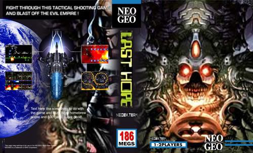
Knee slapper Bobak, you truely are a knee slapper! Man if anything is lackluster its your brainpower! I dont care if your admin or not anymore someone needs to say it, your bashing of this game is getting stupid and old. Move on if you dont buy GOOD games.... or if you simply are too poor to own such a great looking game! Last Hope looks and sounds fantastic, and SNKP never gave us ANYTHING like this since LAST RESORT in 1991! If someone can bring us some new games and they look as good as this, then so be it, we need new NEO-GEO games dammit, and KOF is getting repettive and old. SNKP doesnt know how to make ANYTHING new anymore. Their creativity died a long long time ago.
Just my 2 cents.

Shito said:Another minor editing example
my second editing attemp:
fixed for constistency:
1) No spacing in the kana spine writing (more correct)
2) Different colour pattern for the spine writing than the front logo /using the same one is cheap and unseen in the NeoGeo official insert)
3) NeoGeo logo on both spine and front cover
4) TM and original writing under the NeoGeo Logo
5) Spine genre babbling removed from front cover (where is not dued)
6) A bit of relocating of spine elements
60 copiesAbasuto said:This thread is too long to read through now, but how many copies of this game were made ?


Sapphire said:60 copies
Question:
Would you also pay 700$ for a homebrew game when it's not a NeoGeo Game??

BIG BEAR said:I would shrink the Last Hope Logo just a tad,position it dead center just under that rounded portion of what I believe to be a steering mechanism. Next I would position the meg count in the bottom left and a smaller neo geo logo to the bottom right.
DEV•TEAM belongs in the top-left portion of the insert and on the base of the spine relacing that small Dev Team text.
-BB

Shito said:it's quite funny the manual seems still full of 'broken japanese' to me, like the レザーのトラップ which sounds quite odd in Japanese, I think any Japanase would just use レザートラップ instead. But that's ok and fun to me: SNK used engrish for so many years, so a bit o japaneez won't hurt I guess
hanafudaX said:As in laser? If so, then レーザー is correct.